Summary
Life expectancy in the UK has been on an upward trend for decades. The 2010s challenged this, before the pandemic reversed it. The chart below discusses potential reasons for this.
What does the chart show?
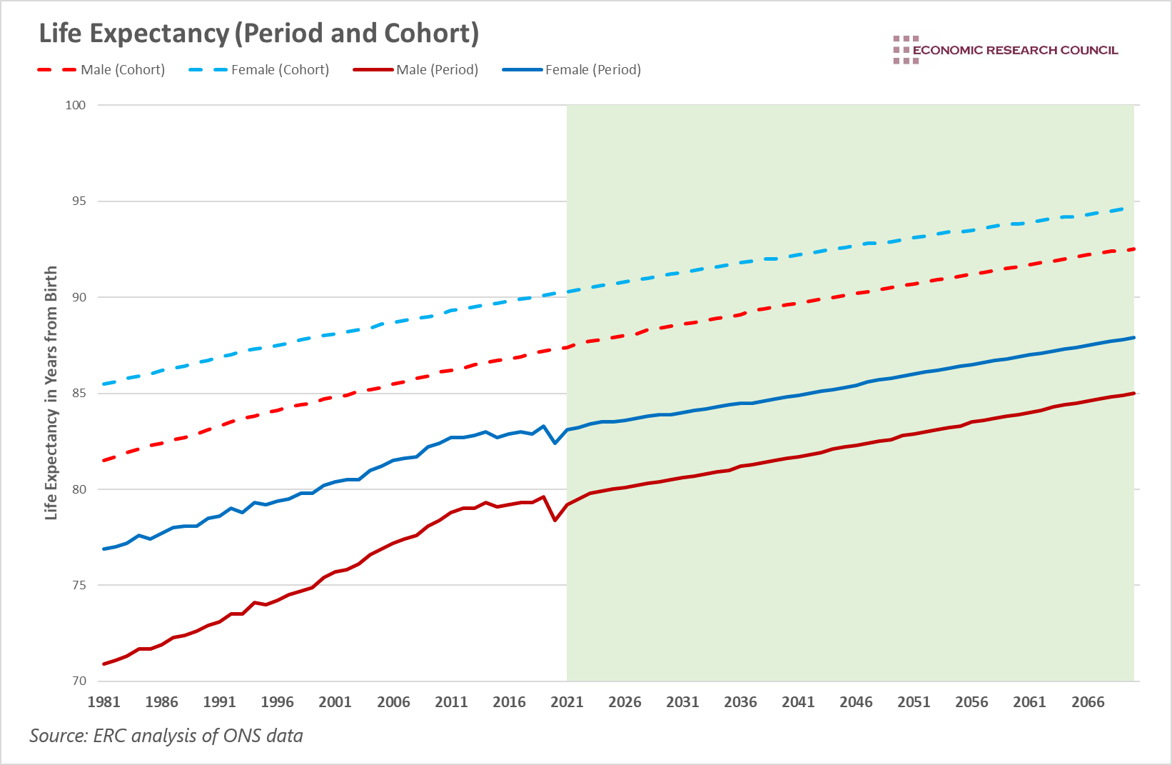
The chart displays two measures of life expectancy for males and females. The data starts from 1981 and includes projections up to 2070. Solid lines represent period life expectancy, which is the average number of additional years a person would live if they experienced age-specific mortality rates of the given time period for the rest of their life. Dashed lines represent cohort life expectancy, which is the average number of additional years a person would live taking into account assumed future changes in mortality for their cohort over the remainder of their life. Red lines represent males, while blue lines represent females.
Period life expectancy (PLE) tends to be lower than the cohort life expectancy (CLE), as it does not include any assumptions about future mortality rates. As such, it is a useful measure to use when comparing trends.
Why is the chart interesting?
Both the period and cohort measures seen in the chart display the well-known understanding that the life expectancy of females tends to be higher than males. Despite this, the chart displays other interesting observations. Firstly, under both measures, the gap in life expectancy has narrowed between the start of the period of analysis and the present day, and is predicted to continue to narrow. In 1981 women were expected to live 4 years longer than men under CLE, and 6 years longer under PLE, but this is forecasted to reduce to just over 2.1 years, and 2.9 years respectively. In fact, this narrowing of the gap has occurred since the early 1970s and is largely attributable to the changing structure of work. The decline of mining, a male-dominated industry, improved the physical conditions of working men. More broadly, there has been a movement away from physically intensive labour, partly portrayed by the transition from manufacturing to the services sector. In addition to this, we have also seen a reduction in the proportion of men smoking. Across all age groups, men have been more likely to smoke than women. These factors, over time, have improved the physical condition of men relative to women, helping to narrow the gap in life expectancy.
The period life expectancy data also brings up an important point of analysis. Between 1981 and 2010, life expectancy for both men and women increased at a steady pace. However, 2012 was a noticeable turning point. Between 2012 and 2018, male and female life expectancy grew by 0.3 years, and 0.2 years respectively. To put this into context, for the 100 years up to 2010, life expectancy grew by 3 years every decade, on average. A number of theories have been put forward to explain this slowdown. Some have suggested that a deceleration in improvements in cardiovascular disease played a part. Others suggest that bad flu seasons over the period led to excess deaths, especially for those over the age of 75. Some suggest that austerity measures placed constraints on health and social care, resulting in excess deaths. A 2021 study published in The Lancet concluded that reductions in local government funding between 2013 and 2017 resulted in an additional 9,600 deaths in people under the age of 75. Despite this, similar slowdowns were experienced in other European countries, though the severity was greatest in the UK.
Another striking aspect of the chart is the effect that the Coronavirus pandemic has had on life expectancy. Over the years of the pandemic, the CLE remains smooth as it takes into account future improvements in mortality and is less responsive to immediate changes. However, PLE shows a significant drop in life expectancy, falling from 83.3 years for females and 79.6 for males in 2019, to 82.4 and 78.4 respectively in 2020. The data used is based on 2020, meaning subsequent years are projections. The protraction of the crisis and the onset of omicron may in fact have decreased life expectancy beyond the figures shown. Nevertheless, the crisis caused 75,000 excess deaths in 2020 and resulted in the largest fall in life expectancy since the Second World War.
By David Dike


