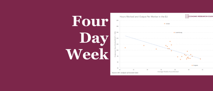
This week’s chart shows a strong negative correlation between hours worked and output per hour. Nevertheless, underlying factors seem to be driving this effect in at least some of the countries mentioned.
Chart of the Week
While it has long been understood that economic activity has been skewed towards London and the South East, the analysis helps us to understand the dynamics of the within-region inequality in output.
Chart of the Week
This week’s chart takes a slightly different angle, assessing the value of environmental degradation from plastic use in various sectors.


