Summary
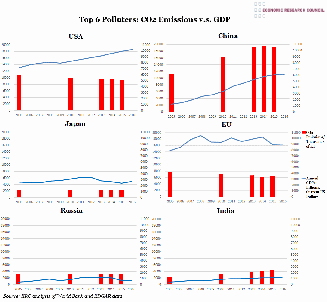
The set of graphs generally indicates that developed countries are beginning to reduce their emissions, whereas India and China are seeing their emissions rise, as they undertake vast infrastructure projects and continue to lift sizeable populations out of poverty. For example emissions in China and India have risen between 2005 and 2015 by 72.3% and 93.3% respectively, although the rise in Chinese emissions has begun to ease from 2014. Conversely the EU in the same period reduced its CO2 emissions by 17.7% from 4.2tn tonnes in 2005 to 3.46tn tonnes in 2015 (for the USA and Japan this percentage drop has been 12.13% and 3.17% respectively, with Russian emissions rising just 1.43%). GDP has steadily risen in India and China. China’s rapidly increasing GDP is evidenced by a rise of approximately $8trn in the period from 2005 to 2016. GDP is relatively flat in Japanese and Russian economies due to a range of factors. Russia’s economy has suffered due to sanctions imposed during the Ukraine crisis but more severely by the dramatic drop in oil price. Oil revenue constituted around 68% of all Russian exports and around 16% of its GDP in 2014.
Japanese growth has always been historically low and their emissions follow this trend too. The stability of emissions may be due to the country’s small land mass and population, which once necessary infrastructure has been established, is unable to expand further.
What do the charts show?
These charts show the amount of CO2 emissions in thousands of kilo tonnes produced each year, displayed by the red bars and plotted against the right hand axis. Each entity’s annual Gross Domestic Product is shown in billions of US dollars at current prices and is displayed by the blue line measured against the left hand axis. In separate charts are the data for each of the world’s biggest 6 polluting entities which in descending order are China, USA, EU, India, Russia followed by Japan. There is some difficulty in the collection of emissions data and this data was only collected on an annual basis from 2013 giving rise to the gaps between certain years.
Why are the charts interesting?
While it is important that this country data is now being collected annually, it is not really possible for conclusions to be drawn about how and to what extent governmental or consumer attitudes to the environment are undergoing change. This is due to the globalisation of production and manufacturing, as well as the variation between governments in their environmental policy for the future. An example of this is the Chinese government’s commitment to spend $361bn before 2020 on the development of renewable energy sources. Additionally, as net exporters, a significant proportion of Chinese and Indian emissions will be attributable to the production of goods to meet consumer demand in other countries. Similarly, many emissions-intensive processes, which are actually to the benefit of developed nations, often occur elsewhere. The production of soy and other grain for animal feed used in the rearing of animals typifies this as the animals are disproportionately consumed, and indeed wasted, in more developed countries.

