Summary
This morning the UK’s production index for the end of 2015 was released, and it showed that the poor end to the year left the UK’s production sector, and in particular manufacturing, smaller than at the end of 2014.
What does the chart show?
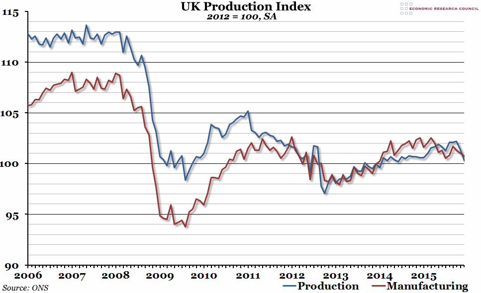
The chart shows a seasonally adjusted index measuring output of the production industries in the UK over the past ten years, with 2012 being equal to 100. The red line shows the manufacturing output, which is a subset of the overall production industries output shown by the blue line. The other elements that also make up the production index are mining and quarrying, and the utility industries such as electricity and water.
Why is the chart interesting?
The production sector was hit particularly hard by the recession in 2008, falling almost 15% in terms of output. There was a brief period of recovery, followed by another (deeper) trough in 2012. Since then, while the economy as a whole has recovered, the production industries have remained fairly flat. In the first half of last year, it looked as though growth might have returned somewhat, but a very poor end to the year left the production sector’s output down on the same point in 2014, and roughly the same level as it was in the post-crisis trough of 2009. The largest contribution to this end of year slump has come from manufacturing, which seemed to be stable in 2014 before enduring an awful 2015.
The biggest implication of today’s production figures is for future GDP estimates; the preliminary fourth quarter GDP growth figure of 0.5% had assumed that production output would only fall by 0.2% in the last quarter of the year. In fact, it fell by 0.5%, and this may lead to the second estimate (due at the end of this month) revising down the headline figure.

