Summary
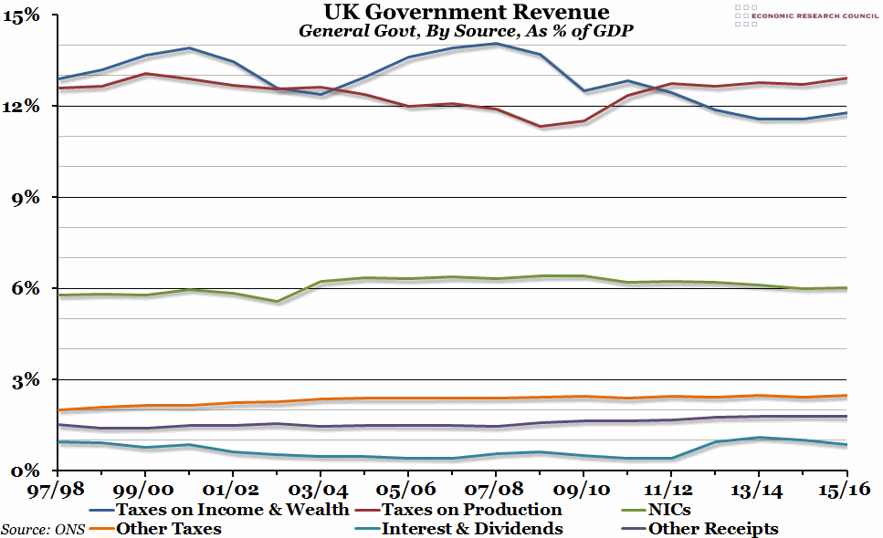
Yesterday, the Office for National Statistics released updated figures for the UK government finances in the financial year 2015/16. We’ve updated our regular graph showing the relative importance of each source of revenue to reflect the latest numbers.
What does the chart show?
The chart shows general government (meaning both central and local government combined) receipts by source, as a percentage of gross domestic product (GDP). The six sources shown are the largest sources of income for the government: taxes on income and wealth, taxes on production, National Insurance contributions, other taxes (including council tax, vehicle duty, and TV licences), interest and dividends (from both private and public sector loans and investments, and including dividend payments from the Bank of England’s Asset Purchase Facility), and other receipts (mostly rent).
Why is the chart interesting?
Total receipts as a percentage of GDP peaked in 1999/2000 (at 37.3%) and then again in 2007/08 (36.8%), but they have been largely stable between 35% and 37% of GDP over at least the last twenty years or so. However, there have been more significant movements within individual sources of revenue over that period. For example, taxes on production overtook taxes on income and wealth in the financial year 2011/12 (as long as you exclude National Insurance, which is by most standard definitions a tax on income but for government accounting purposes is categorised separately), and has remained a percentage point of GDP higher since. This is both due to the increase in the rate of VAT (the single largest tax within the production tax category) from an emergency rate of 15% up to 20% between 2009 and 2011, and a decline in income tax and corporation tax revenues after the 2008 recession. Corporation tax receipts have particularly fallen in relative importance as the tax rate has been lowered from 30% in 2008 to 20% in 2015, with even nominal receipts £3bn lower in 2015/16 than they were in 2007/08 (before you take into account inflation or the growth of the UK economy).
The other noticeable feature of this graph is the bulge in receipts from the “interest and dividends” category from 2012/13 onwards. This is when the Bank of England’s period of quantitative easing started to feed through into the government finances, with a total of almost £38bn in dividends received by the government in the four years since then.

