Summary
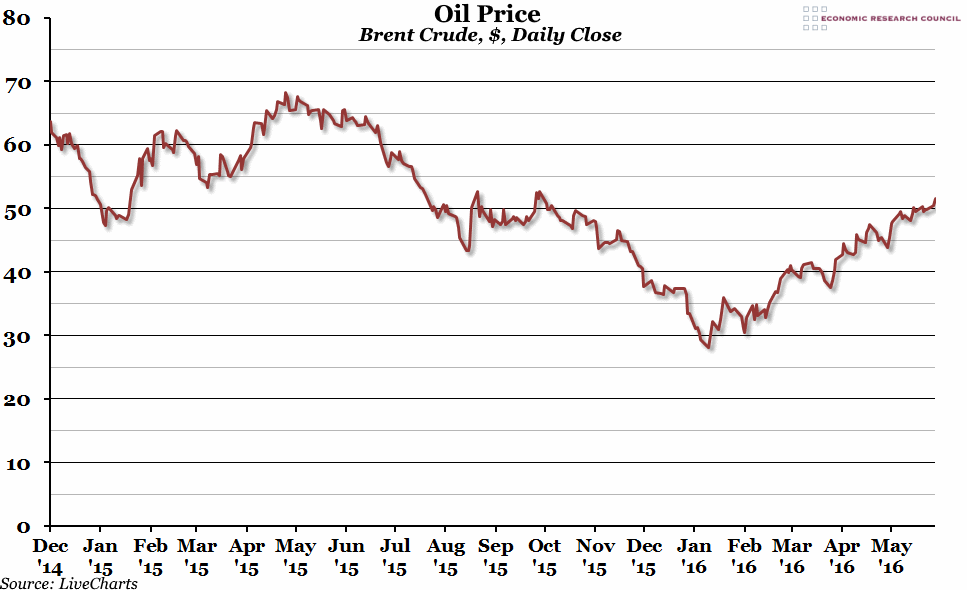
The price of a barrel of Brent Crude oil reached an eight month high yesterday, continuing the general trend we’ve seen since the beginning of the year. We are nearing the critical point (for inflation figures) where the price will be up on the same time last year.
What does the chart show?
The red line shows the dollar price of a barrel of Brent Crude oil (the main global price), at the close of trading each day, for the last eighteen months.
Why is the chart interesting?
The movement in oil prices over the last two years has been fascinating, and crucial to the global economy in a number of ways. This time last year, the price was around the $65 mark, and that was considered low compared to prices regularly over $100 for a number of previous years. The price then continued to fall further, first to below $50, then $40, and then reached a trough at just under $30 a barrel. Since then, supply problems around the world have pushed the price back up to over $50 (the closing figure yesterday was $51.55 – the highest since October 2015). However, while that trend may continue, higher prices might also tempt more suppliers back into the market (particularly shale producers in the US), which in turn could depress prices.
The low oil price has been one of the key factors in keeping inflation subdued over the past year and a half, which has been an economic boost for net oil consuming countries (but a serious burden on oil producers and exporters). However, as we reach a point where the oil price is up compared to the same point in the previous year (which is likely to happen later in the Summer), those effects will fall out of the official inflation figures and we should see prices start to rise.

