Summary
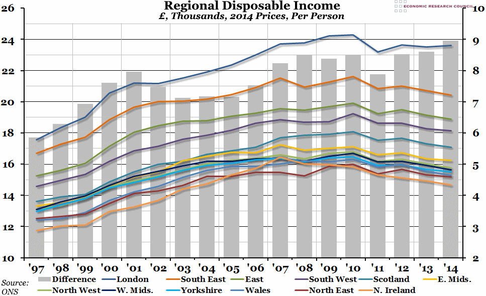
Data released by the Office for National Statistics this morning showed that the gap in gross disposable income between the richest region of the UK (London) and the poorest (Northern Ireland) opened up to the largest it has been since records began in 1997, at just under £9,000 per person.
What does the chart show?
The chart shows the per capita gross household disposable income (that is, income for households and non-profit making institutions serving households, after taxes and benefits have been paid), in thousands of pounds, inflation adjusted to reflect 2014 price levels. Regions are listed in the legend from richest to poorest in 2014. The grey bars, measured against the right hand axis, show the difference between the richest and the poorest region each year, in thousands of pounds.
Why is the chart interesting?
In 2014, not only was London the region with the biggest per capita disposable income, but it was also the only region where disposable income went up in real terms (after inflation). In every other region, it continued to decline after the mini-peak in 2012 (however, even in London real income per capita is still lower than the main peak in 2010). This divergence has widened the gap between the richest and poorest regions; in London, the real per capita disposable income was £23,600 in 2014, compared to just £14,650 in Northern Ireland (a gap of almost £9,000). That gap is now wider than at any other time since records began in 1997 (when it was under £6,000).
However, London is also the region with the biggest internal inequality. Disposable income in “Inner West” London was roughly double that of any other part of London (and 2.2 times the income in the poorest region, “Outer East and North East” London). Having said that, even Outer East London’s disposable income per person of £18,700 is still higher than the UK average of £17,965, and makes it richer than all but two sub-regions outside the area delineated by Bedfordshire to the north and Hampshire to the West: Cheshire East, and Aberdeenshire. This doesn’t take into account regional variations in the cost of living, but nevertheless it clearly shows the growing divergence between the richest and poorest regions in the UK.

