Summary
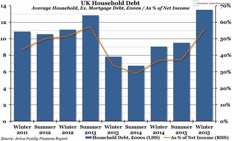
Aviva’s latest Family Finances Report contains the worrying statistic that average household debt is now at its highest point since they started tracking it in 2011, although it is not yet quite as high as a proportion of net household income as it was in Summer 2013.
What does the chart show?
The blue bars represent average total debt (excluding mortgage debt) per household in thousands of pounds, measured against the left hand axis. This data is based on a survey carried out by Aviva. The orange line represents this debt as a percentage of annual net household income (also estimated by Aviva), measured against the right hand axis.
Why is the chart interesting?
Average household debt increased steadily between Winter 2011 and Summer 2013, particularly as a proportion of income, when it reached a peak. This coincides with a prolonged period of falling real disposable income, which meant that households were forced to build up debt if they wanted to keep their levels of consumption stable. Between Summer 2013 and Summer 2014, real disposable incomes started to recover, and households manage to pay down their debts. However, since then, debt has been on the rise again, and Aviva estimate that in Winter 2015 average household debt (excluding mortgages) was equal to £13,520 per household (£700 more than the previous peak in 2013). Due to rising net incomes, debt as a percentage of net household income is not quite as high as it was back then (55.7% compared to 57.6%), but any figure over 50% is remarkably high.
This chart suggests that the growth we had in 2015 may have been largely down to consumer borrowing, which is ultimately unsustainable, and this poses a serious risk to the UK’s long-term economic performance.

