Summary
While we’ve been away over the Christmas break, global stock markets suffered another shock, which once again originated in China. This is perhaps a fitting way to end a year that has been affected by a volatile Chinese stock market.
What does the chart show?
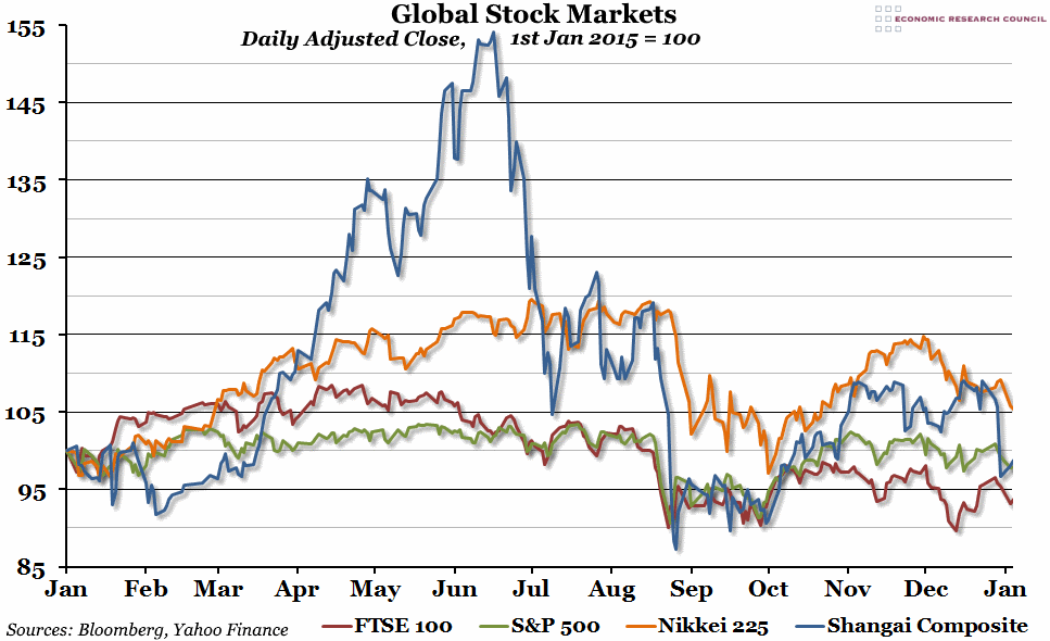
The chart shows four stock market indices (measures of the prices of stocks in a selected group of companies), all rebased so that the beginning of 2015 is equal to 100 (this makes it easier to compare across different stock markets). The dark blue line is the Shanghai Composite Index, a representative index of Chinese shares. The red line is the FTSE 100, a compilation of the largest 100 stocks in the UK. The green line is the S&P 500, a collection of 500 companies which is said to represent over 70% of all US equity. The orange line is the Nikkei 225, a measure of the top 225 companies from the Tokyo Stock Exchange.
Why is the chart interesting?
There has been another stock market shock building over the last fortnight. The Shanghai Composite Index was the first to take a hit, as it was open and trading over Christmas, followed by the S&P, Nikkei, and FTSE indices on their first days of trading after Christmas. As a result, only the Japanese Nikkei index finished the year higher than it started it (although the S&P 500 was close), and the FTSE finished 5% down on the year. The performance of the FTSE (and to a lesser degree, the S&P) has been fairly dismal since the middle of the year, when a second Chinese stock market crash in August had a knock-on effect on the rest of the world. Looking back at 2015, it seems obvious that the extreme Chinese bubble that built up in Spring and early Summer was unsustainable, and the reduction in the value of the index was really a return to normal, but it nevertheless had a signficant and lasting effect on the rest of the year.

