Summary
At the end of last week, the Office for National Statistics released their annual international comparison of productivity for 2014, and it showed that although the UK’s productivity increased very slightly, our relative position within the G7 worsened to the lowest point on record.
What does the chart show?
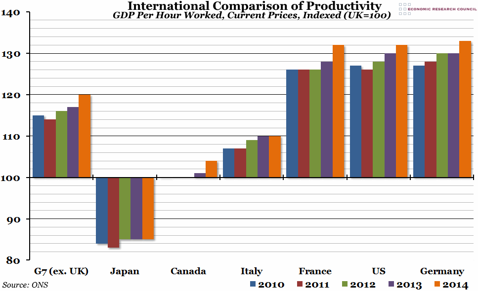
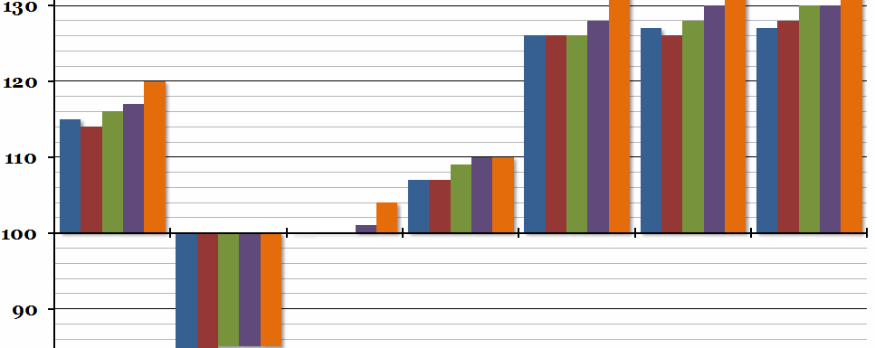
The chart shows national output (measured by GDP) per hour worked, relative to the UK, for the G7 countries over the past five years. In each time period, the UK’s productivity is equal to 100, so any number less than 100 represents a lower productivity than the UK, and vice versa.
Why is the chart interesting?
The “productivity puzzle” has been an issue for the UK economy for a few years now, and although GDP per hour worked improved very slightly in 2014 (from 99.4 to 99.6, where 100 is equal to the UK’s productivity in 2007), it improved by more in other advanced economies. This led to the gap between the UK and the rest of the G7 opening up considerably (with the exception of Japan, which has consistently had much lower productivity rates than the UK over the past 25 years). The rest of the G7 is now 20% more productive than the UK on average, and while it hasn’t been unusual for the UK to have a lower productivity rate than most of the other G7 economies since ONS records began in 1990, this is the biggest difference over that period. The problem is highlighted when you consider that with the exception of Italy (for whom 2007 was an unusually high peak), every other G7 economy has now exceeded their 2007 level of productivity, while the UK remains slightly below it.

