Summary
David Cameron set out his aims for “full employment” this week, defining it as having a higher employment rate than other developed economies. The UK is already doing better in this category than many of our rivals, but we have a long way to go to become top.
What does the chart show?
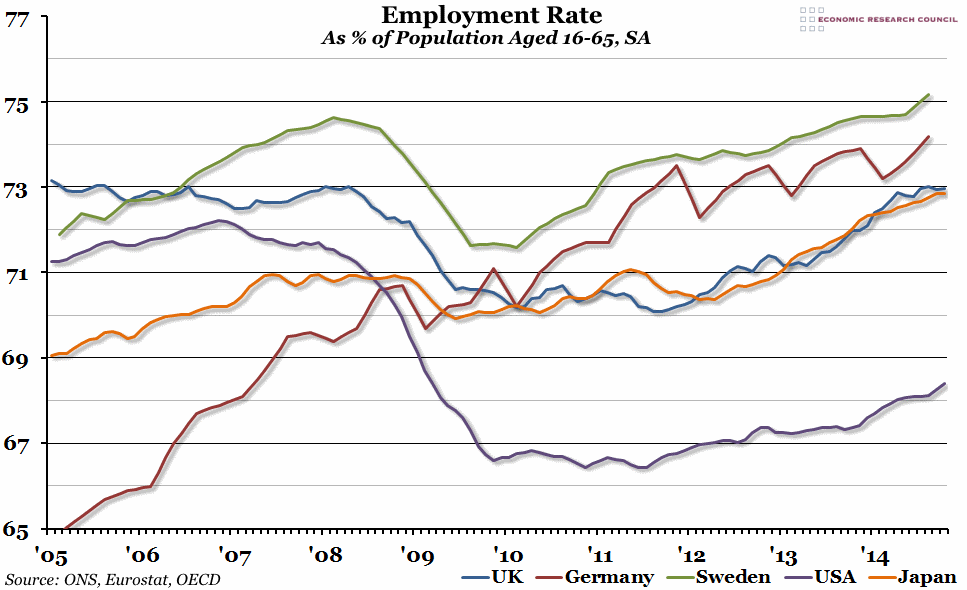
The chart shows the employment rate for a selection of countries. The employment rate is defined as the percentage of the population aged between 16 and 65 who are currently in work.
Why is the chart interesting?
“Full employment” used to mean the minimum level of unemployment required to not boost inflation, but that isn’t the sense in which it was used by the Prime Minister this week. Instead, David Cameron set a target for the employment rate in the UK to be higher than in other developed countries. Despite strong employment growth in the UK, the employment rate has only just recently reached the pre-crisis peak (73%, where it has been for a few months in a row), as the working age population has also been increasing. However, this is significantly better than in the US, where the employment rate was hit particularly hard by the financial crisis in 2007-08, and has struggled to recover since.
At the moment, the employment rate in the UK is most similar to Japan, which started from a lower base and wasn’t particularly affected by the crash. If we are really going to have the highest employment rate out of all the developed economies, Germany is the first target, followed by countries like Sweden with employment rates of over 75%.
You can listen to Greg Opie talking about this Chart of the Week on Share Radio by clicking here.

