Summary
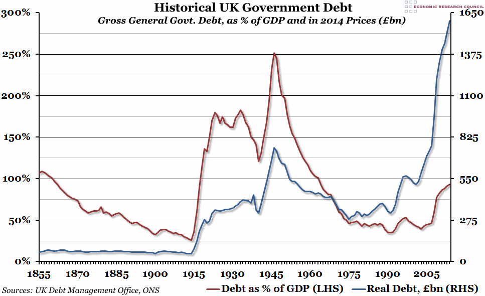
Public sector finance data for the financial year 2014/15 was released at the end of last week, so we’ve updated our annual chart tracking historical UK government debt over the last 160 years.
What does the chart show?
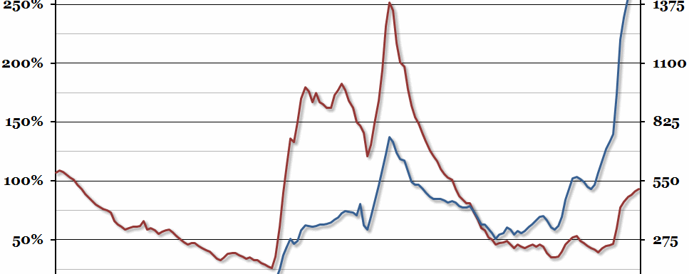
The chart shows the level of gross debt held by general government (central government plus local governments) in the UK. The red line, measured against the left hand axis, shows debt as a percentage of Gross Domestic Product. The blue line, measured against the right hand axis, shows real debt levels in 2014 prices (that is, allowing for inflation using historical CPI) in billions of pounds. Please note that general government gross debt is not the preferred method of measuring public debt – that is Public Sector Net Debt – but it is the best historical data we have available.
Why is the chart interesting?
Although public sector net borrowing fell by £11.1bn to £87.3bn in the financial year 2014/15 compared to the previous year, gross debt is obviously still rising, and is now well over £1.5 trillion. Even in real terms, that is more than double the previous peak in 1946. However, GDP is much higher now than it was 70 years ago (particularly after the effects of fighting two world wars), and our debt to GDP ratio remains below 100%.
The key question remains how the debt is ever going to be paid down. In previous eras, government have relied on inflation to do the hard work (for example, in the thirty years between 1945 and 1975, when real debt fell from £755bn to £278bn, nominal debt only fell in six of those years). If the current low levels of inflation persist in the medium to long term, it will probably be the government finances that suffer the most.

