Summary
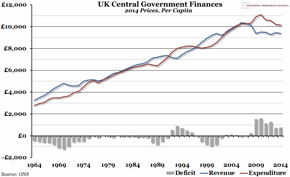
With the annual UK Budget due this afternoon, we’ve updated our yearly chart showing the central government finances per person. In 2014, the deficit rose slightly, mainly driven by a fall in revenues.
What does the chart show?
The red line shows total real expenditure payable by central government (i.e. not including local government) per capita, in 2014 prices. The blue line shows central government receipts receivable (mostly taxes), also per capita in 2014 prices. The grey bars show the real deficit per person (expenditure minus revenues). A negative deficit represents a government surplus.
Why is the chart interesting?
Looking at government finances in real per capita terms can help to make the numbers involved more manageable. In 2014, central government expenditure per person fell slightly to just over £10,000 – around the level we last had in 2005. However, revenues also fell by almost £100 per person to the third lowest level since 2002 (2009 and 2012 were also low points). This has pushed the annual deficit up by £27.50 per person to around £765.
The problem of low revenues remains a key issue for the UK. After the financial crisis in 2008, the largest deficit in over fifty years opened up, driven both by higher spending and lower revenues. While spending has been slowly cut back to pre-crisis levels since then, revenues have remained sluggish, mainly due to the “productivity puzzle” that is facing the UK economy. Whoever is Chancellor after the May elections should concentrate on boosting productivity to help ease the deficit.

