Summary
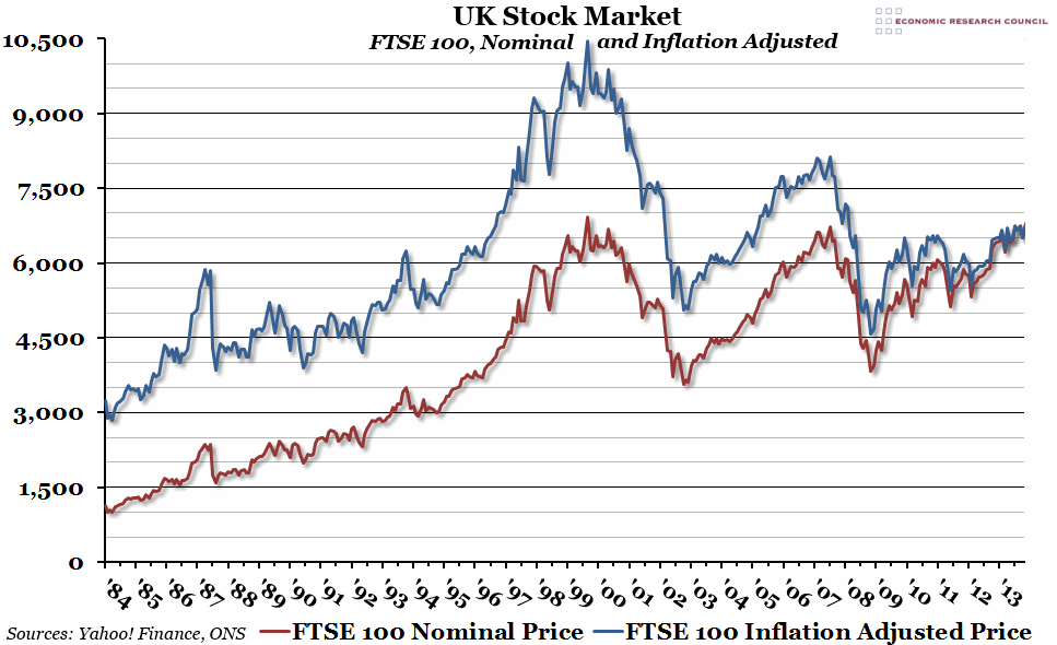
The FTSE is 30 years old this year, so we’ve decided to take a look at its inflation adjusted performance over that time.
What does the chart show?
The chart shows the monthly FTSE 100 index (an index of the performance of the 100 most valuable companies on the main list of the London stock exchange). The red line is the nominal price, while the blue line is the price adjusted for inflation, in today’s prices (using RPI, rather than the usual CPI, as historical data for the RPI measure of inflation goes back further).
Why is the chart interesting?
Just looking at the nominal index value would lead you to believe that the FTSE 100 is near an all-time peak, and should be shortly breaking new ground (possibly in time for the 30 year anniversary in April). While this is technically true, the inflation adjusted value tells the real story. Generally speaking, the thirty year history of the FTSE 100 can be broken up into two periods. The first fifteen years, from 1984 to 1999, saw a period of accelerating gains in both real and nominal terms. The second fifteen years, however, has seen two major crashes and a general trend downwards in real terms. These days, the FTSE 100 would have to reach a value of over 10,000 to beat the peak reached at the end of 1999 in today’s money.
If you’d like to hear more about this, you may be interested in the ERC event on Monday 24th February with David Craig (“The Great Savings and Pensions Scandal”), who will be covering similar topics. Tickets are still available from here.

