Summary
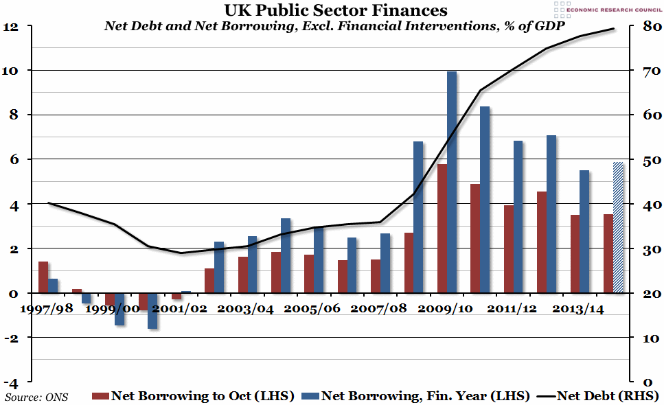
Government finance figures were released at the end of last week, and they suggested that the government deficit in 2014/15 may end up higher than it was during 2013/14 – and the sixth highest in the last twenty years.
What does the chart show?
The black line, measured against the right hand side, shows the total public sector net debt, excluding the effect of financial interventions, as a percentage of GDP. The coloured bars, measured against the right hand side, show public sector net borrowing, also excluding financial interventions and as a percentage of GDP. The red bar represents total net borrowing between April and October for each period, while the blue bars are for the whole financial year. The final blue bar, for 2014/15, is an estimate based on annual spending up to this point. A positive figure for net borrowing is the budget deficit; a negative figure for net borrowing means there was a budget surplus that year.
Why is the chart interesting?
The level of government debt continues to be a major issue in economic conversations. Since 1997, but before the recession, government deficits and surpluses were relatively small as a proportion of GDP (around -2% to 4%), with debt consistently below 40% of GDP. However, since then, both the deficit and the debt have grown much larger (which is partly a function of GDP shrinking during the recession, but also due to higher spending and lower revenues), with total government debt almost reaching 80% of GDP in October. Moreover, despite the government rhetoric about austerity, net borrowing this year looks set to be higher than last year (although strong GDP growth might help to counter that). And if our projection is accurate, that would push total debt firmly over the 80% mark, to almost 83% of GDP.

