Summary
UK public sector finances were released yesterday, showing that the deficit so far this financial year is higher than last year. They were also the first set of government finances produced using the European system, which makes international comparisons easier.
What does the chart show?
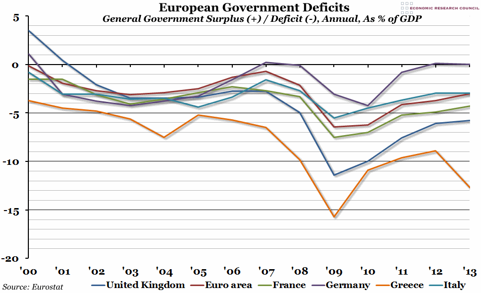
The chart shows the annual general government deficit (or surplus, in a few rare cases) for a selection of European countries as a percentage of their GDP since 2000. The countries included are the UK (in dark blue), the 18 countries of the Euro Area (in red), France (in green), Germany (in purple), Greece (in orange), and Italy (in light blue). Negative numbers represent a budget deficit, while positive numbers are a surplus.
Why is the chart interesting?
At the beginning of the 21st century, the UK had one of the largest government budget surpluses in Europe. It was certainly much higher than many of our direct competitors. However, the financial crisis in 2008 hit the UK particularly hard, and by 2009 we had one of the largest deficits. Although the UK government has been reducing the deficit slowly since that trough in 2009, we are still in the unenviable position of being behind Italy, France, and even the euro area average – and a long way behind Germany, who have managed to roughly balance their budget for the past couple of years. So far this year all the data we have suggests that in 2014 our deficit might increase for the first time in five years, which is likely to put us even further behind.

