Summary
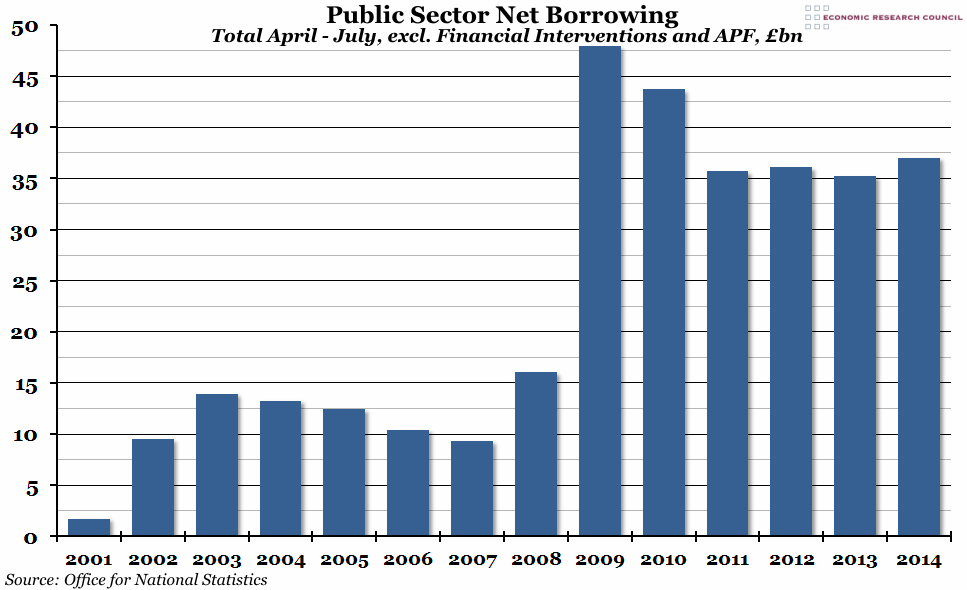
Government financial statistics were released at the end of last week, showing that public sector net borrowing was higher in the first third of the financial year than in any other since 2010.
What does the chart show?
The graph shows total public sector net borrowing (the main measure of the total government deficit) for the first four months of each financial year (April to July), in billions of pounds. This figure excludes financial interventions (relevant from 2008 onwards), the Royal Mail pension plan, and the Bank of England Asset Purchase Facility (APF) (from 2012 onwards). It does not take inflation into account.
Why is the chart interesting?
Although July is usually a relatively good month for government finances, the first four months of the financial year taken together are generally a good indicator of how the finances will look at the end of the year (the big exception to this is 2008/09, when the majority of government borrowing came disproportionately late in the year). So far, 2014/15 hasn’t been good, ranking third worst in the 21st century behind 2009/10 and 2010/11 (both exceptionally bad years).
While central government receipts increased by almost £4bn compared to the same period last year (mainly due to VAT, stamp duty and corporation tax receipts going up), central government expenditure also increased compared to last year (on state pensions and other departmental spending) and there was a fall in the local government surplus as well, leading to the extra borrowing requirements.

