Summary
The UK public sector finances for the financial year 2013-14 were released at the end of last week, so we have updated our previous graph on sources of government revenue over the past ten years.
What does the chart show?
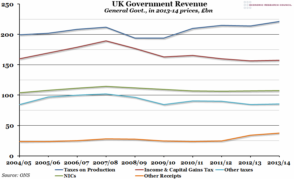
The chart shows general government (meaning both central and local government combined) receipts by source, in billions of pounds, adjusted for inflation (in 2013-14 prices). The five sources shown are the largest sources of income for the government: taxes on production (including VAT), income and capital gains taxes (including those paid by businesses), national insurance contributions (NICs), other taxes (including corporation tax and local government taxes), and other receipts.
Why is the chart interesting?
From 2004 to 2009, the two biggest sources of income (taxes on production and taxes on income) roughly moved together; each year, the government would either receive more money from both sources, or from neither. However, over the past five years the two have diverged, with income tax revenues falling while production tax revenues rose. This continued in the last financial year, with income tax revenues basically static in real terms, while production tax revenues rose by the biggest margin since 2010/11. The other sources of income remained relatively flat, with a small increase in “other revenue” – mostly due to an increase in interest and dividend payments.

