Summary
The Office for National Statistics released further analysis of the 2011 census results this morning, looking at the link between employment and qualifications. In this week’s chart, we take a look at some of the findings.
What does the chart show?
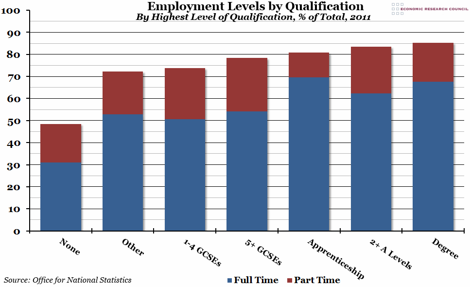
The chart shows employment level (that is, the percentage of the total population aged between 25 to 64 that is in employment) for seven different groups based on their highest level of qualification. Within each group, we have also added how many of those people are in full-time (in blue) or part-time (in red) employment, as of the 2011 census.
Why is the chart interesting?
As you would probably expect, having a degree makes you more likely to have a job. However, completing an apprenticeship is more likely to lead to full-time employment, rather than a part-time job, than any other qualification. Furthermore, there was actually very little difference between the employment levels of people with apprenticeships, A Levels, and degrees; the real difference between them comes in the type of job and the salary they command (professional/technical compared to skilled labour). The employment level for people with no qualifications at all is below 50% (and it is this group that has the largest proportion of part-time workers), although a large quantity of those not in employment are not currently looking for work, either due to disability or training.

