Summary
At the end of last week, the Land Registry published their House Price Index data for April 2014 which showed that over the whole of England and Wales, house prices went up by 1.5% on the previous month and 6.7% on the same time last year. However, this hides vast regional differences.
What does the chart show?
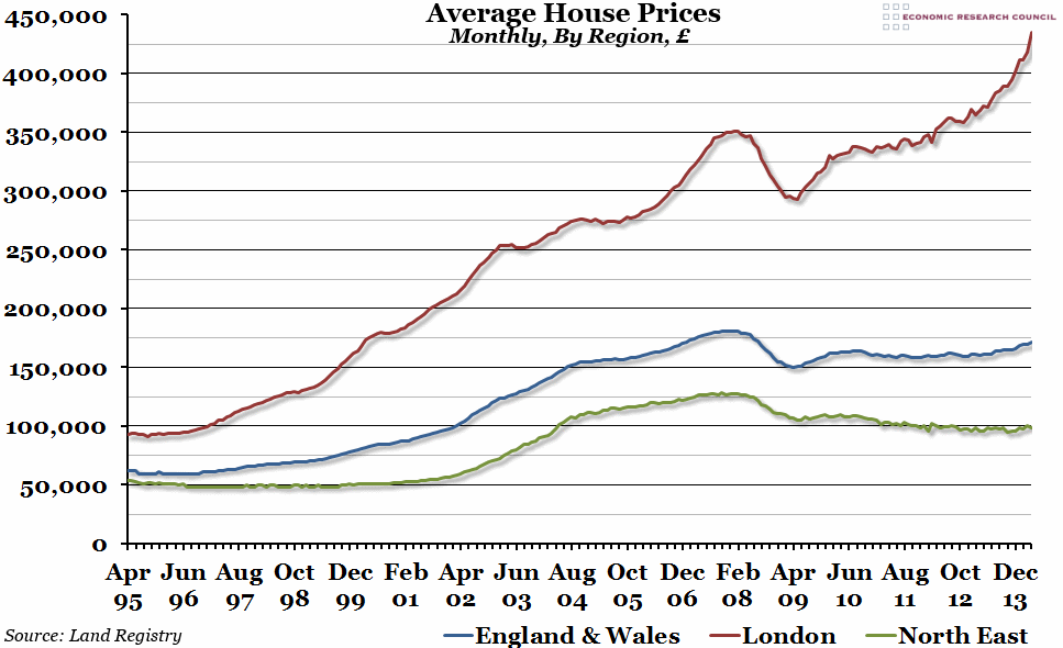
The chart shows monthly average house prices, by region, as reported by the Land Registry. The average prices are calculated using a database consisting of all residential property transactions across England and Wales, standardising price changes based on repeat sales. The blue line represents the average house price in the whole of England and Wales, the red line just in London, and the green line in the North East region.
Why is the chart interesting?
This chart makes clear how misleading it is to talk about the “average house price”, without taking into account regional differences. Across England and Wales, house prices have increased by 6.7% over the last year, but remain about £10,000 below their peak price in late 2007. However, in the North East, a region where house prices have historically been lower than the rest of the country, prices have only increased by 2.9% over the last year, and actually fell in April compared to March. Compared to their peak price, homes in the North East are still around £30,000 cheaper than they were in 2007.
The differences between the North East and the national average are small, however, compared to the London market, where there has been an annual increase in prices of 17%, and prices are now around £90,000 higher than their previous peak value in 2007.
If you’d like to hear more about the performance of the UK residential property market, come along to the ERC’s Second Annual “Boom or Bust” Property Discussion next week, where you’ll get a chance to put your questions to a panel of property experts. For more information, and to book tickets (which range from £5 – £15), please click here.

