Summary
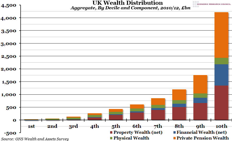
Towards the end of last week, the third wave of the Office for National Statistics’ “Wealth in Great Britain” report was released. It contained lots of interesting information (you can view the full report here), but one of the graphs that stood out was this one, on wealth distribution by decile and component of wealth.
What does the chart show?
The graph shows total aggregate wealth, initially broken down by decile of population, and then into components of wealth. Each bar represents total wealth of a particular decile (10%) of British households, in billions of pounds. Within each bar, total wealth is broken down into four components: net property wealth in red, net financial wealth in blue, physical wealth in green, and private pension wealth in orange.
Why is the chart interesting?
Both elements of the chart are interesting: the distribution of wealth between deciles, and the breakdown within each decile. The distribution of wealth looks fairly extreme; the two poorest deciles are barely visible on this scale, while the wealthiest 10% are more than twice as rich as the next wealthiest 10%. The ONS has been carrying out this survey at regular intervals (this is the third one), and actually total wealth distribution between deciles has not changed all that much, particularly at the top and bottom.
The components of wealth change considerably as you go up the scale as well (as you would probably expect). Property and physical wealth become smaller proportions of overall wealth as you get richer, while private pension wealth and financial wealth become much more important. In fact, the top decile own more in private pension wealth than the total wealth of the bottom 60% of the population added together. Although you can’t really see it on this scale, at the poorer end of the population financial and property wealth are both net negatives, while physical wealth makes up a huge proportion of overall wealth.

