Summary
A lot has been happening in the European bond yield markets this week, as a recent (successful) sale of bonds by the Irish government gave a boost to borrowing rates across Europe, and the gap between UK and German bond yields increased to the largest it has been since 2005.
What does the chart show?
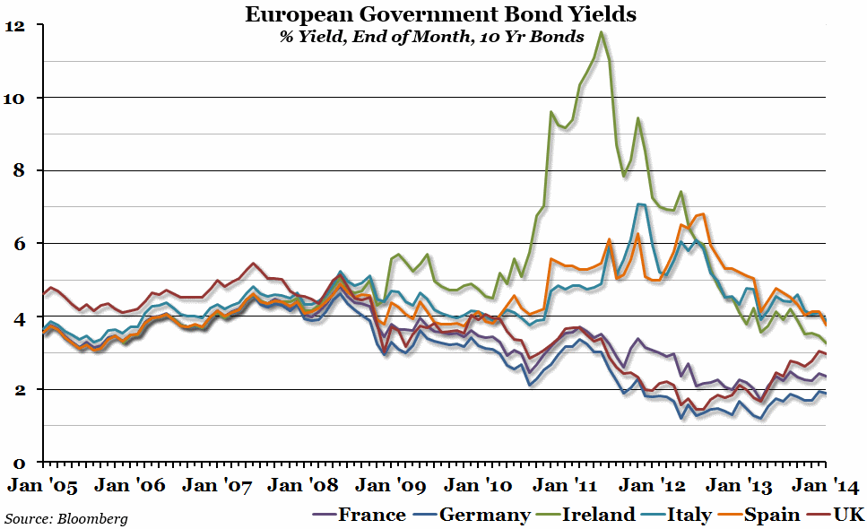
The chart shows the percentage yield on ten year government bonds (effectively, a measure of the cost of borrowing for governments), as reported at the end of each month, for a number of European countries: France, Germany, Ireland, Italy, Spain, and the UK.
Why is the chart interesting?
With high levels of government debt across Europe (and many other countries), the cost of borrowing is of serious importance. There have been two stories this week regarding bond yields; the first was that the gap in the interest rate facing the UK and German governments had opened up to the largest it has been since 2005. As you can see from the graph, bond yields for the UK and Germany tracked each other fairly closely for five years between 2007 and 2012, but then yields for UK government bonds began increasing. The second story is that Irish government bonds have been selling well, pushing yields down not only in Ireland but in other EU countries that had previous been considered potentially unsafe, such as Spain. In fact, Irish bond yields are now almost lower than UK bond yields, which was almost unimaginable back in mid 2011!

