Summary
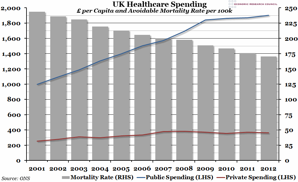
Per capita healthcare spending in the UK has slowed down massively since the 2008 recession, with spending on private healthcare decreasing even in nominal terms since the peak in 2007. However, the mortality rate doesn’t seem to have been affected (yet).
What does the chart show?
The blue and red lines represent annual nominal public and private per capita spending on healthcare in the UK, measured against the left hand axis. The grey bars represent the average of the male and female age-standardised mortality rates for all avoidable deaths, or the number of people per 100,000 of the population that died from causes that were classified as “avoidable” each year, measured against the right hand axis.
Why is the chart interesting?
The recession in 2008 clearly had a big impact on healthcare spending, both in the public and private spheres. Nominal per capita spending (that is, without taking inflation into account) flattened noticeably, and as we pointed out last year, one might expect that to have an effect on mortality rates. However, this hasn’t yet been the case, with deaths from avoidable causes (ie. treatable illnesses, accidents, and intentional injuries such as murder and suicide) continuing to fall each year. Of course, if the slower increases in spending reflect less investment in healthcare services, then we may see the effects appear further in the future.

