Summary
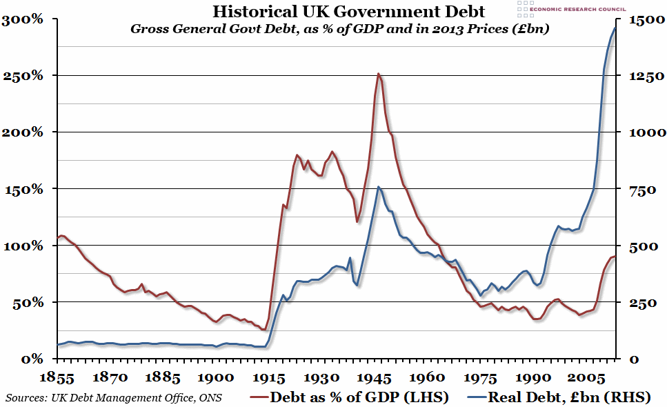
The latest public sector finances were released this morning, so we decided to update our chart from this time last year showing historical UK government debt going back to 1855 (this time in 2013 prices).
What does the chart show?
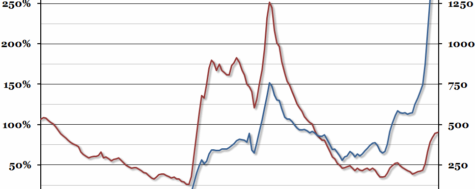
The chart shows the level of gross debt held by general government (central government plus local governments) in the UK. The red line, measured against the left hand axis, shows debt as a percentage of Gross Domestic Product. The blue line, measured against the right hand axis, shows real debt levels in 2013 prices (that is, allowing for inflation using historical CPI) in billions of pounds. Please note that general government gross debt is not the preferred method of measuring public debt – that is Public Sector Net Debt – but it is the best historical data we have available.
Why is the chart interesting?
The latest figures, showing the level of debt up to 2013, show that debt continues to rise as a percentage of GDP (if you exclude financial interventions). Although debt as a percentage of GDP has been higher historically in the UK, that has usually been during times when GDP has been very low. If you look at how real debt has changed, it was basically steady until the First World War, and it has never really recovered since. The period of decline between 1945 and 1975 is mostly due to inflation devalueing the debt. Since the financial crisis in 2008, the real level of general government debt has almost doubled (it is now just short of £1.5 trillion).

