Summary
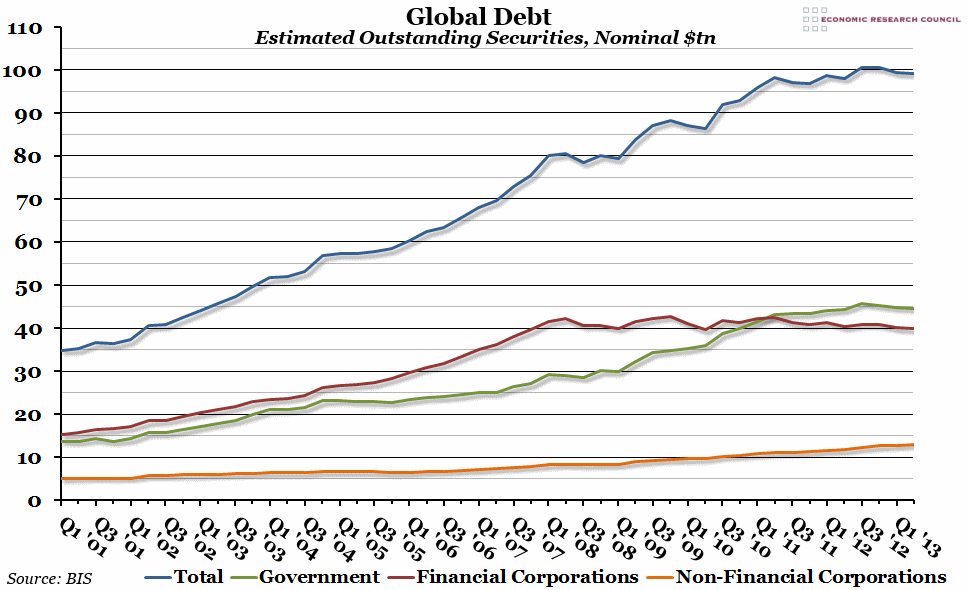
This week, the Bank of International Settlements published their Quarterly Review, which included an interesting chart showing the estimated level of outstanding global debt.
What does the chart show?
The blue line shows the total estimated size of the global debt securities market (combining both domestic and international markets, and looking only at amounts outstanding) in trillions of dollars. The three other lines show this figure broken down into the three main sectors that the debt comes from: general governments in green, financial corporations in red, and non-financial corporations in orange.
Why is the chart interesting?
The BIS report only includes figures for up to the second quarter of 2013, but it looks like global debt levels have stayed relatively constant since the middle of 2012, at around $100 trillion. This is a huge figure, especially compared to the $35 trillion level at the beginning of 2001. It is interesting to see the break-down between sectors, however. Previously, financial corporations had been responsible for issuing more of the debt than governments (particularly on international markets). However, in response to the financial crisis of 2008, levels of outstanding debt issued by financial corporations have remained steady since then. In contrast, debt issued by government sped up after the crisis, and overtook the level of financial corporations at the beginning of 2011.
An interesting sidenote is that according to a report by the US Federal Reserve last week, the US owes $59 trillion of the roughly $100 trillion of outstanding global debt – an overwhelmingly large proportion.

