Summary
Exactly five years ago today, the Monetary Policy Committee of the Bank of England voted to lower the Bank Rate to 0.5%. It is fair to say that nobody at the time predicted that this record low would last as long as it has. This year’s forecast for when the rate will rise is different to previous years, however.
What does the chart show?
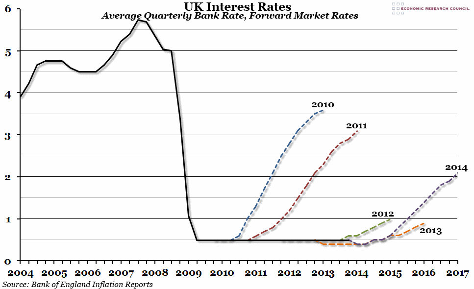
The black line on the chart shows the official Bank Rate (the base interest rate set by the Bank of England), averaged out over each quarter, since the beginning of 2004. Each dashed line shows the forecast for future interest rates shown in each of the last five February Inflation Reports. These estimates are based on the overnight swap rates in the three weeks leading up to the Report.
Why is the chart interesting?
The Bank Rate was lowered to 0.5% on the 5th March 2009, and at the time it was considered an emergency position that would only last for a year or so. Five years later, the Bank Rate is still at rock bottom. In the Bank’s Inflation Report of February 2010, rates were expected to rise to 1% by the end of the year, and to reach over 3.5% by the beginning of 2013. In each successive Inflation Report until 2013, this estimate was pushed back as it became clear rates were not going to rise in the immediate future. However, this year’s report broke that trend, with the latest market estimates suggesting an expectation that rates will rise to 1% by the middle of next year, and may hit 2% in 2017.

