Summary
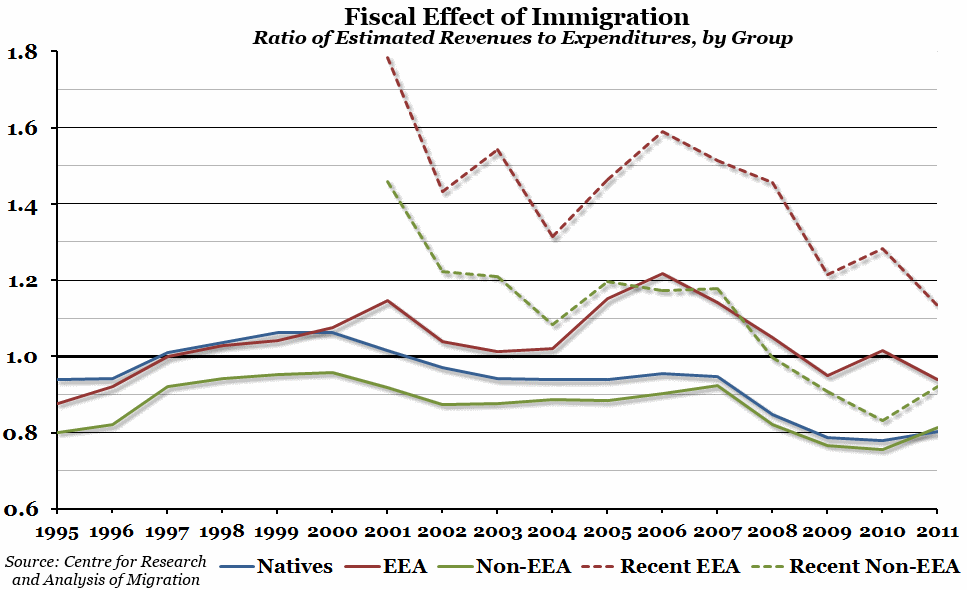
A paper was published this week by the Centre for Research and Analysis of Migration (based in UCL), investigating the impact different immigrant groups have on the UK Government’s budget. This week’s chart is based on data from that study, showing the ratio of revenue to expenditure for each group.
What does the chart show?
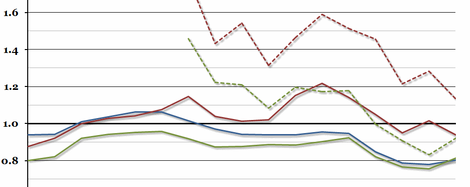
The chart shows estimated total government revenue received divided by the estimated total expenditure of a number of different groups. The blue line shows the native population, the solid red line shows all immigrants from the European Economic Area (EEA), and the solid green line shows all non-EEA immigrants. The two dashed lines, in red and green, show only recent immigrants from the EEA and the rest of the world respectively. Recent in this context means since 2000. In all cases, a value above 1 represents a net contribution to the government, and vice versa.
Why is the chart interesting?
Contrary to some recent reports in the media, this study suggests that immigrants from the EEA since 2000 have made a net contribution to our government finances, while the biggest drain on government resources in 2011 (the latest figures included in the report) was the native population. However, there are a number of other trends on display. Immigrants from the EEA have generally been a positive fiscal influence, and generally more recent migrants have made more of a net contribution than less recent migrants from the same group. Non-EEA immigrants used to have the smallest revenue to expenditure ratio, but since 2007 that group has basically converged with the native population.
More generally, the ratio has been declining across all groups since 2007 (just before the financial crisis), although there was the slightest hint of an up-turn in 2011 for the native and non-EEA immigrant populations.

