Summary
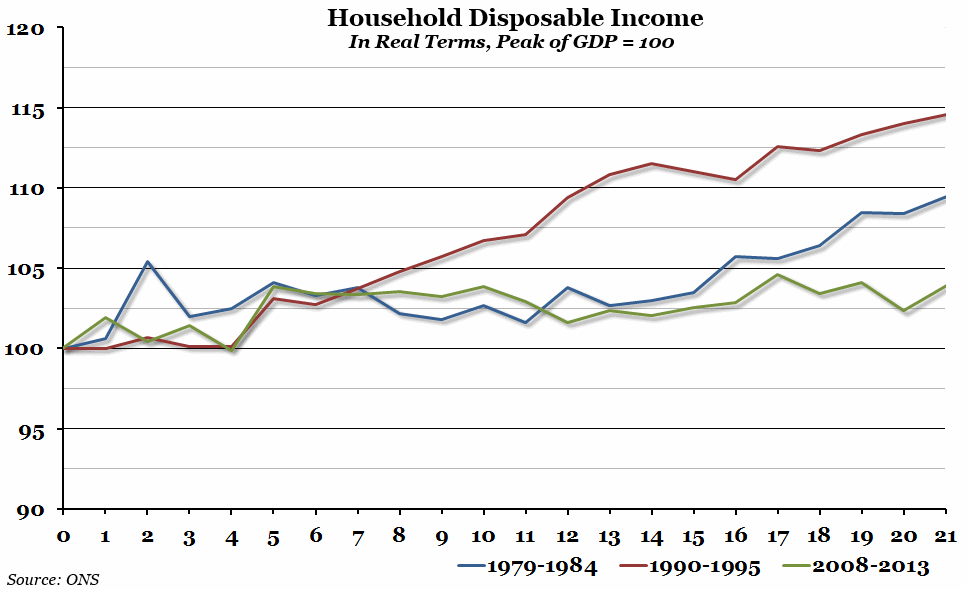
The Office for National Statistics November Economic Review pointed out this week that although we have begun to experience decent economic growth again, there has been very little growth in real household disposable income since the beginning of 2009. This is in contrast to the recoveries from previous recessions.
What does the chart show?
The chart shows real household disposable income (that is, average household income after spending on essentials, adjusted for inflation) for 21 quarters since the peak before three recessions (in Q2 1979, Q2 1990, and Q1 2008). In each case, it has been indexed so that the amount of disposable income at each peak is equal to 100.
Why is the chart interesting?
Preliminary estimates of Q3 GDP growth, announced last week, suggested that the economy grew by 0.8% last quarter. Added to the 0.7% growth in Q2, this begins to represent the first sustained period of growth since the crisis in 2008. However, real household disposable incomes were the same last quarter as they were in Q2 2009, despite GDP growth over that period of more than 4%. It has been a common theme in this current crisis, but once again disposable incomes are taking longer to recover from the crash than they have in any recent recession (unfortunately, we couldn’t find data for the 1920s and 1930s). Hopefully, we will start to see the up-turn soon.

