Summary
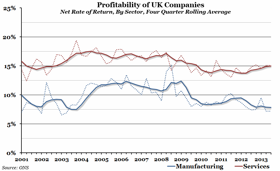
There has been quite a contrast in profitability in the services and manufacturing sectors recently, with the services sector at a four year high, while the manufacturing sector is at a ten year low.
What does the chart show?
The chart shows the profitability (net rate of return) of all private non-financial corporations in either the services sector (in red) or the manufacturing sector (in blue). The solid lines are the average of the previous four quarters, while the dotted lines show the quarterly data (which can be somewhat volatile). The net rate of return is the ratio of the operating surplus to the capital employed, as a percentage.
Why is the chart interesting?
The services sector has been more profitable than the manufacturing sector in the UK for the fifteen years that the ONS has been keeping track of the net rate of return (except for one quarter in 2008, when manufacturing profits were boosted by a quarter of exceptional performance in a couple of key companies). However, over the past couple of years they have been diverging further. While both were hit by the recession in 2008, the services sector appears to have recovered faster, posting the highest yearly average since mid-2009 this week. Meanwhile, profitability in the manufacturing sector has remained low, and the yearly average is at the lowest point since late 2003, despite the 0.9% increase in manufacturing output between the first and second quarters of 2013.

