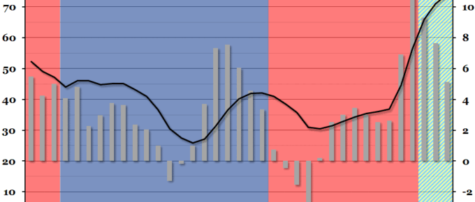
Public sector finance figures were released at the end of last week, showing that net borrowing had decreased in the financial year 2012/13.
Chart of the Week: Week 47, 2013: The Graduate Labour Market
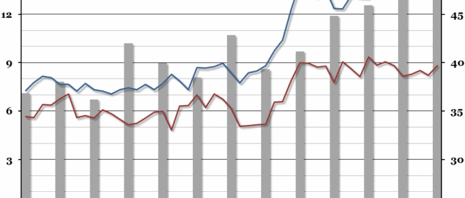
Summary Following on from our chart last week on underemployment, this week we looked at the interaction between recent graduates and young non-graduates in the labour market, courtesy of a recent ONS report. What does the chart show? The red and blue lines show the unemployment rate (the percentage of people within a group that […]
Chart of the Week: Week 46, 2013: Underemployment
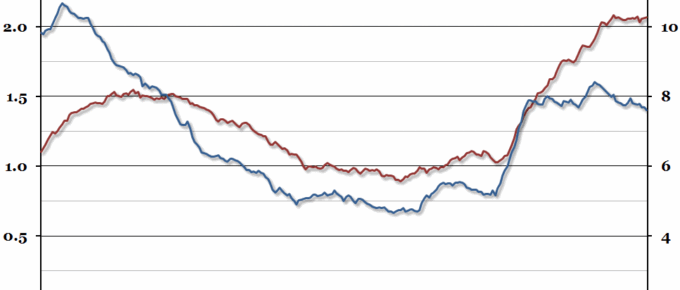
The unemployment rate over the past three months fell to 7.6%: the lowest point since the first half of 2009.
Chart of the Week: Week 45, 2013: Fiscal Effect of Immigration
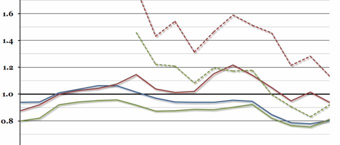
A paper was published this week by the Centre for Research and Analysis of Migration (based in UCL), investigating the impact different immigrant groups have on the UK Government’s budget.
Chart of the Week: Week 44, 2013: Household Disposable Income
The Office for National Statistics November Economic Review pointed out this week that although we have begun to experience decent economic growth again, there has been very little growth in real household disposable income since the beginning of 2009.
Chart of the Week: Week 43, 2013: European Debt-to-GDP Ratios
Now that the US debt crisis is over (until next time a deadline looms), we can turn our attention back to Europe.

