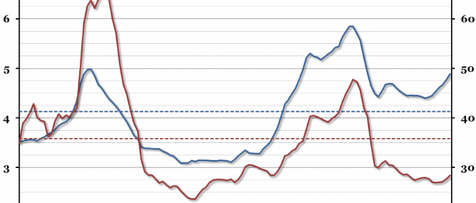
Following on from our graph recording the impressive US recovery a fortnight ago, this week we have taken a look at the much more limited recovery in the euro zone.
August 2014
Global trade and a great deal of prosperity generated over the last decade or so has depended on the free movement of goods and people. In the last few months there has been an insidious and growing disruption to both. The shooting down of the Malaysian airliner over Ukraine has caused a hidden but very major disruption to airline routes. It had been assumed that airlines …
Chart of the Week: Week 33, 2014: Weekly Hours Worked
The labour market recovery is now in full flow with unemployment falling to 6.4% in the second quarter of 2014.
Chart of the Week: Week 32, 2014: The American Recovery
In contrast to the UK recovery (covered by last week’s chart), the US economy has been looking very positive for a while now.
Chart of the Week: Week 31, 2014: UK Recessions and Recoveries
The preliminary estimate of GDP growth for the second quarter of 2014, released at the end of last week, suggested that the UK economy has finally overtaken the previous peak of output before the recession in 2008.
Chart of the Week: Week 30, 2014: UK Housing Affordability
This year, our annual chart on housing affordability shows quite a dramatic increase in the house price to earnings ratio, and unlike last year, mortgage affordability has also declined.

