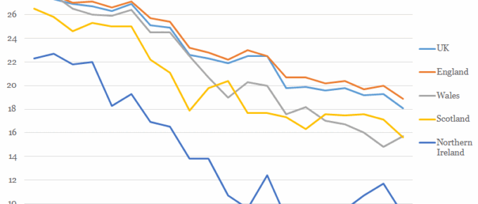
This Tuesday 4th April was ‘Equal Pay Day’, a date symbolically chosen in the USA for two reasons: it roughly represents the date when the average woman would need to work to, from 1st of January 2016, to match the average man’s 2016 earnings.
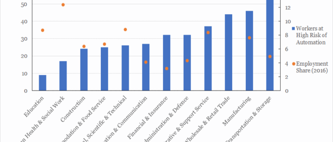
Chart of the Week: Week 12, 2017: Workers at Risk of Automation by Sector
This analysis suggest that up to 30% of UK jobs are considered to be at high risk of automation by the early 2030s.
March 2017
Since my thoughts at the beginning of February, which followed a few intensive days in Washington DC, nothing has happened to change my view of Trump. He is, however, proving…
Chart of the Week: Week 11, 2017: Eurozone Companies’ Reaction to Political Risks
While 2017 will see a number of different political risks coming to the fore, what is clear is that uncertainty about both Britain’s new relationship with Europe and the future policies of the Trump administration are perceived to pose the biggest risk to Eurozone businesses.
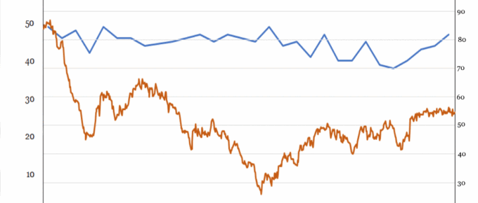
Chart of the Week: Week 10, 2017: Oil Price v.s. Scottish Nationalist Sentiment
While the decline in price of a barrel of Brent Crude oil has been newsworthy for economists all over the world, it has been scrutinised particularly closely by Scottish Nationalists, as it would prove an important source of income were Scotland to secede.
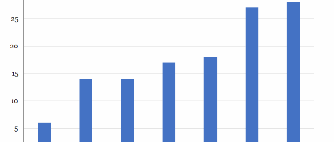
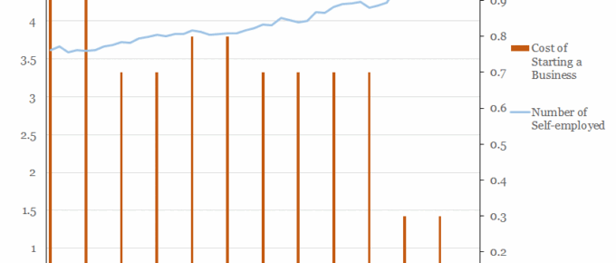
Chart of the Week: Week 9, 2017: Number of Self-Employed v.s. Cost of Starting a Business
The chart shows that a correlation exists between the number of people taking up self-employment and the cost of starting a business in this country.

