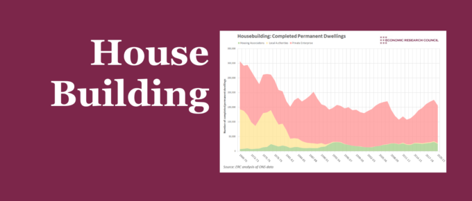
This week’s chart assesses how the supply of housing has changed over time, and the extent to which we can learn from the factors that have caused these changes.
Chart of the Week
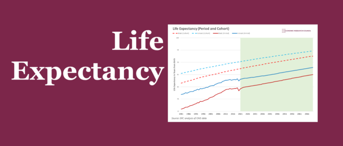
Life expectancy in the UK has been on an upward trend for decades. The 2010s challenged this, before the pandemic reversed it. The chart below discusses potential reasons for this.
Chart of the Week
With our first entry of the year, Chart of the Week assesses the optimism of different sections of the UK on the economy over the year ahead.
Chart of the Week
The pandemic has affected countless aspects of our lives, but how has it altered our spending on gifts?
Chart of the Week
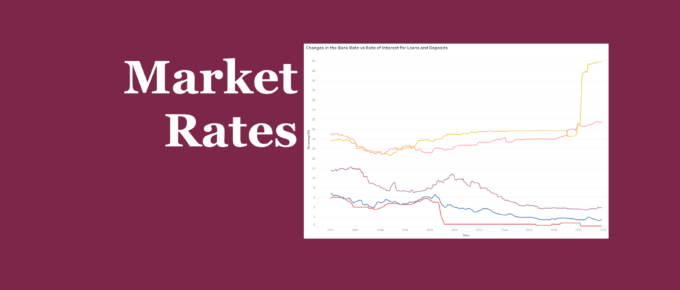
Explore our interactive chart to see how market rates have reacted to changes in the Bank Rate.
Chart of the Week
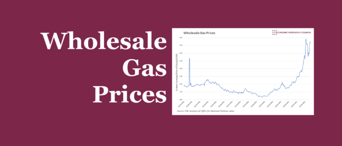
The raising of the energy price cap has attracted a lot of attention and may have assisted in keeping some smaller providers in the market. This week’s chart analyses wholesale gas prices, and what the future may hold if prices continue to rise.


