At the end of last week, the ONS released a report on how wages have changed over time, particularly for three cohorts born in 1954, 1964 and 1974.
Chart of the Week: Week 28, 2014: UK Wage Differences
At the end of last week, the ONS released a report on how wages have changed over time, particularly for three cohorts born in 1954, 1964 and 1974.
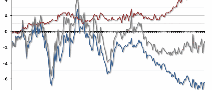
Chart of the Week: Week 27, 2014: UK Trade Balance
Trade deficit statistics have been even more volatile than usual recently, but the UK’s trade balance looks like it has been improving slowly.
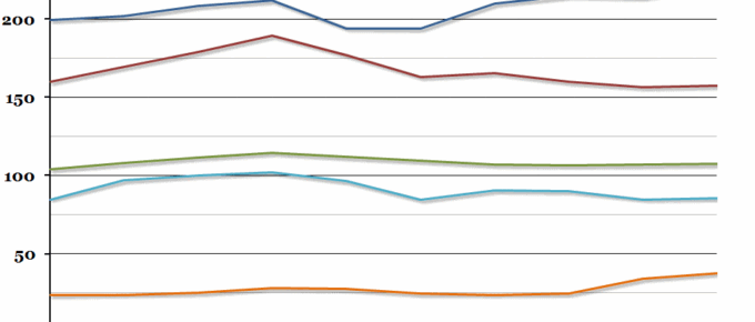
Chart of the Week: Week 26, 2014: UK Government Revenue
The UK public sector finances for the financial year 2013-14 were released at the end of last week, so we have updated our previous graph on sources of government revenue over the past ten years.
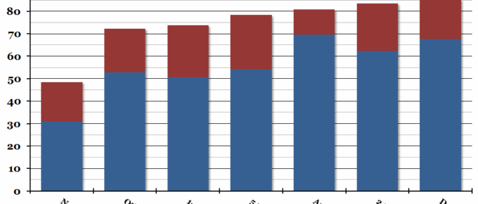
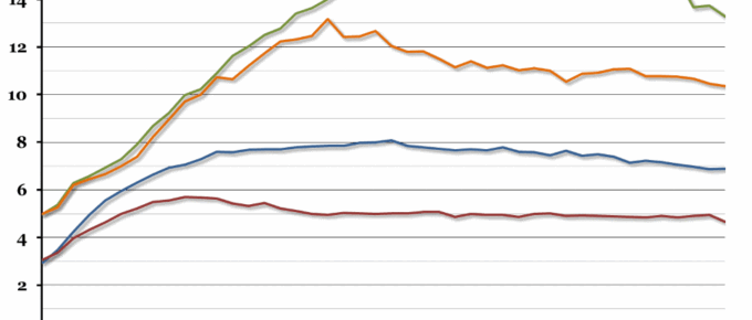
Chart of the Week: Week 25, 2014: Employment Levels by Qualification
The Office for National Statistics released further analysis of the 2011 census results this morning, looking at the link between employment and qualifications.
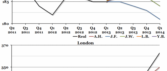
Chart of the Week: Week 24, 2014: 2013 House Price Forecasts
This time last year, the Economic Research Council invited four property experts to share their forecasts for house prices in the coming year.