Summary
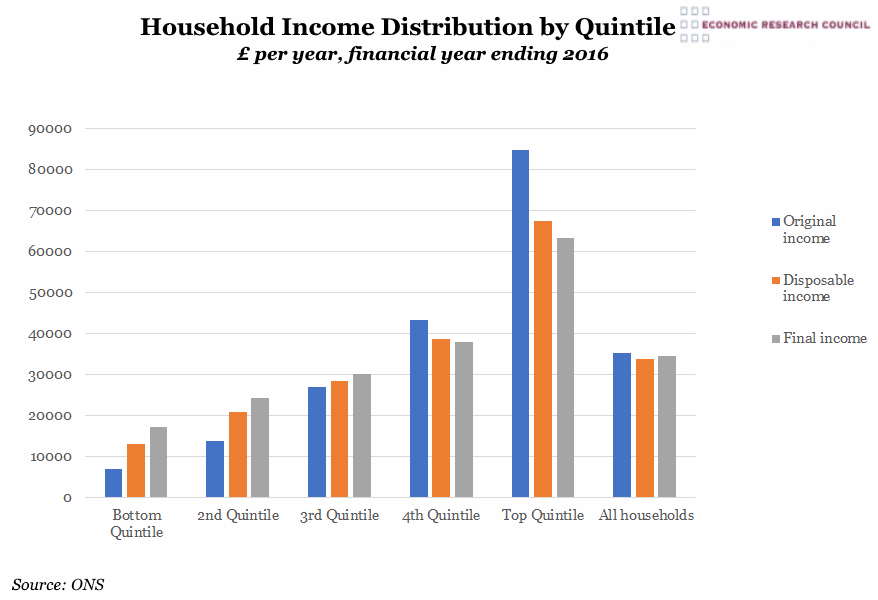
The chart shows that average disposable household income for the top quintile of UK households stands at over £67,000 and that of the poorest quintile is just over £13,000, more than 5 times lower. When considering original income prior to the application of taxes and benefits, the ratio of richest to poorest quintiles is 12 to 1 (£84,700 to £7,200), however this ratio diminishes to less than 4 to 1 once taxes paid and benefits received are included. There has been an increase in average income from employment (or original income) for the poorest quintile, which has reduced this original income disparity from 14 to 1 in the preceding year (financial year ending 2015).
What does the chart show?
This chart displays various measures of income for all households across the United Kingdom in 2016. ‘Original income’ refers to the sum of all money received from employment, private pensions, investments and other non-government sources. Following the receipt of cash benefits and the deduction of direct taxes, for example National Insurance and local taxes, the money that remains is considered ‘disposable income’. Once benefits in kind, such as health and education, are added and indirect taxation is deducted, what remains is ‘final income’. Households by nature are varied and the data shown could represent a range of formats, for example households with one earner and any number of dependents.
Why is the chart interesting?
The division of the data into quintiles goes some way to masking the true disparity between the richest and poorest, as the top quintile encompasses a large range of incomes. The average household in the financial year ending 2016 paid £7,800 in direct taxes, whilst richer households payed more than poorer. As a proportion of household income, poorer households tend to pay far more in indirect taxes, such as VAT or TV licensing, than the richest (27% to 14.4%). Over half of all households, some 13.7 million homes, received more in benefits than they paid in both direct and indirect taxes, although this includes ‘in kind’ benefits, such as healthcare and education. However, this figure is skewed by households that include one or more recipients of the State Pension, which the ONS describes as having ‘consistently made the largest contribution to the overall progressivity of cash benefits over the past 22 years’. For the overwhelming majority of households where there is an employed person of working age, more tax is paid than benefits received.
Socio-economic inequality is a complex issue, often with very divergent conclusions drawn from the vast range of data available. If you’d like to hear more about the topic from statistician and self-confessed ‘inequality-geek’, Dr Faiza Shaheen, please come along to our next lecture. More information and tickets can be found here.

