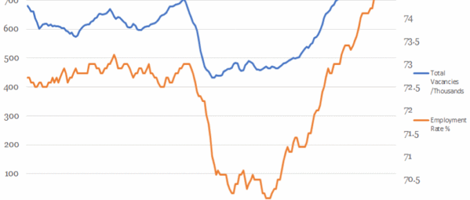
This chart shows that the overall employment rate has been tracked by the number of available jobs until the financial crash.
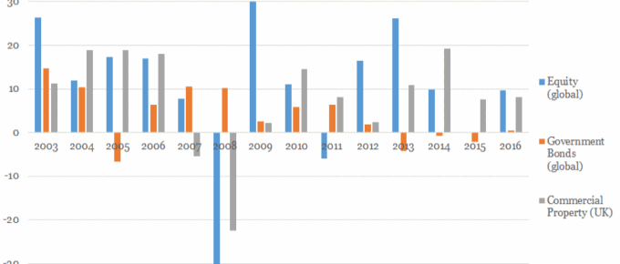
Chart of the Week: Week 24, 2017: Historical Asset Class Performance
This chart shows a snapshot of the performance of different asset classes: UK commercial property, global government bonds and global equity since 2003.
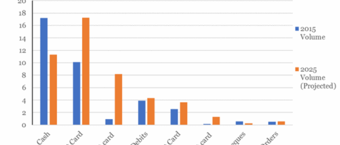
Chart of the Week: Week 23, 2017: Changes to Consumer Payment Methods
The chart shows that cash remains the most popular method of payment in 2015, although following a sustained downward trend, 2015 represents the first year in which under half (45%) of all consumer payments were made using cash.

Chart of the Week: Week 22, 2017: Household Income Distribution
The chart shows that average disposable household income for the top quintile of UK households stands at over £67,000 and that of the poorest quintile is just over £13,000, more than 5 times lower.
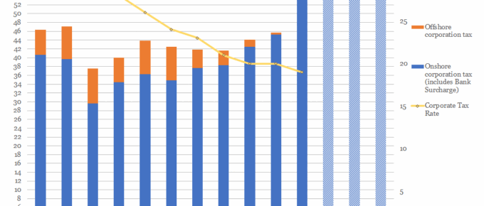
Chart of the Week: Week 21, 2017: Corporation Tax Rates v.s. Receipts
The chart shows that, despite consistent reductions in the taxation rate, yearly receipts of corporation tax have remained relatively stable over the last decade.