Summary
The preliminary GDP growth figures for the second quarter of the year, released yesterday, showed a recovery from the disappointing growth of the first quarter. It was widely reported that the UK had now recovered to pre-crisis GDP per capita levels, but that assumes an unlikely low population growth scenario.
What does the chart show?
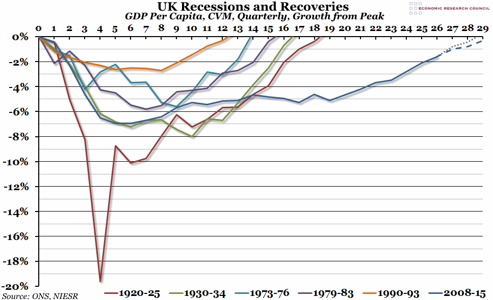
This is an update to a chart we produced last year. It shows the quarterly change in Gross Domestic Product (GDP), divided by estimated population size to give a per capita figure, over the six biggest recessions and recoveries in the last 100 years, compared to the pre-recession peak. The dotted blue line shows a low-growth scenario since the last official ONS population estimates, with the dashed blue line showing a more likely population growth trend based on the average over the last decade. Note that the ONS records only go back to the 1940s, so for the 1920s and 1930s we have used estimates of the GDP originally produced by the NIESR.
Why is the chart interesting?
When the GDP calculations were revised last year, we discovered that the UK had grown back to its pre-crisis peak in 2013, not 2014 as previously thought, although this still represented the longest recovery in at least the last century. However, due to population growth over the last seven years, GDP per capita is only just now starting to reach the 2008 high point. It either got there this quarter, after solid 0.7% growth in Q2, or will do shortly, depending on population growth estimates. Either way, this is coming at least ten quarters later than the previous worst recession, in 1920-25, and three years later than the Great Depression of the 1930s (although the most recent recession was not quite as deep as either of those two examples). This all comes back to the “productivity puzzle”: we are producing less per person than we used to.

