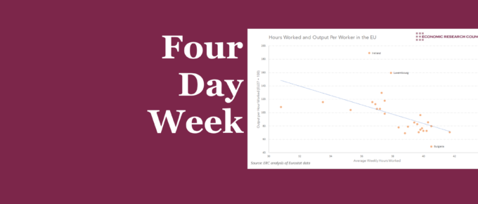
This week’s chart shows a strong negative correlation between hours worked and output per hour. Nevertheless, underlying factors seem to be driving this effect in at least some of the countries mentioned.
Enter your 2019 Economic Forecasts!
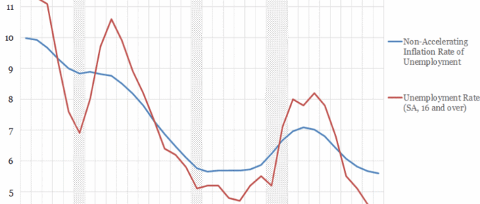
One of the prevailing narratives in economics over the past few decades has been the stifling of wage growth. The NAIRU provides an interesting lens through which to gauge labour market slack. The recent decreases….
Chart of the Week: Historical Trends in UK Unemployment and Effects on Wage Growth
One of the prevailing narratives in economics over the past few decades has been the stifling of wage growth. The NAIRU provides an interesting lens through which to gauge labour market slack. The recent decreases….
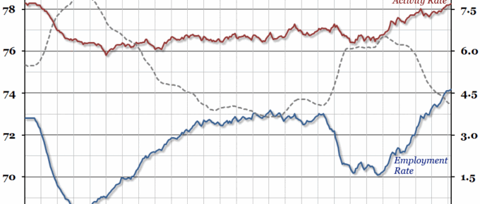
Chart of the Week: Week 20, 2016: UK Labour Market
Today’s labour market statistics (for the first quarter of the year) show that the unemployment rate remained at 5.1%, where it has been since November 2015.
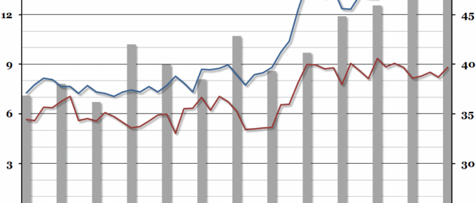
Chart of the Week: Week 47, 2013: The Graduate Labour Market
Summary Following on from our chart last week on underemployment, this week we looked at the interaction between recent graduates and young non-graduates in the labour market, courtesy of a recent ONS report. What does the chart show? The red and blue lines show the unemployment rate (the percentage of people within a group that […]


