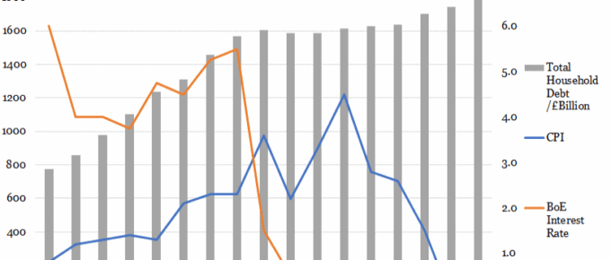
The base rate climbed steadily to 5.5% in 2008 before the global financial crash, after which it plummeted to 1.5% within one year as the Bank attempted to stimulate investment and consumption.
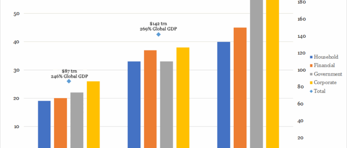
Chart of the Week: Week 28, 2017: Changes in Composition of Global Debt
This chart shows a positive trend in the growth of global debt, growing from $87 trillion in year 2000 to $199 trillion in 2014.
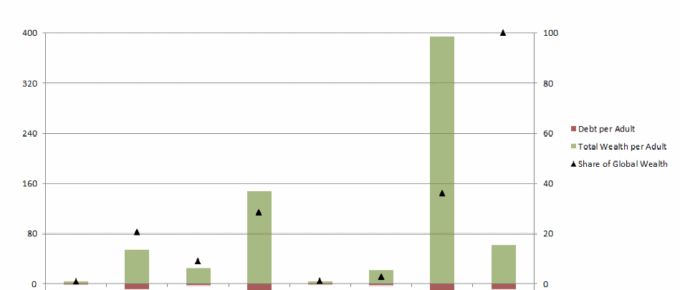
Chart of the Week: Week 52, 2016: Wealth and Debt per Adult by Continent
The chart demonstrates the vast disparities in wealth per adult across the world. North America and Europe hold 65% of the world’s wealth, whilst only accounting for 18% of the world’s adult population.
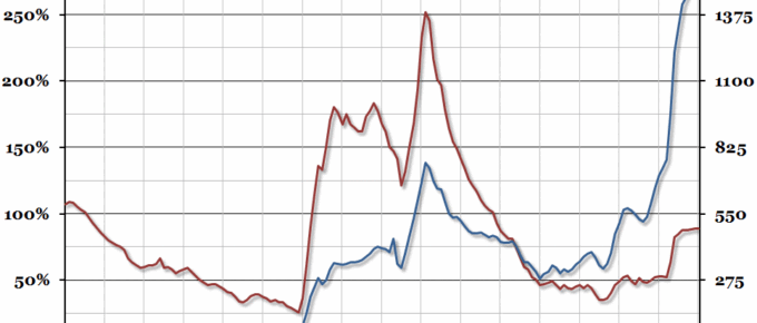
Chart of the Week: Week 18, 2016: Historical UK Government Debt
The public sector finances for the financial year 2015/16 were recently released, showing that Public Sector Net Borrowing (excluding publicly owned banks) fell to £74bn (from £91.7bn in 2014/15).
Chart of the Week: Week 17, 2015: Historical UK Government Debt
Public sector finance data for the financial year 2014/15 was released at the end of last week, so we’ve updated our annual chart tracking historical UK government debt over the last 160 years.
Chart of the Week: Week 11, 2015: UK Central Government Finances
With the annual UK Budget due this afternoon, we’ve updated our yearly chart showing the central government finances per person.

