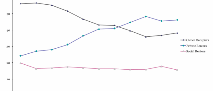
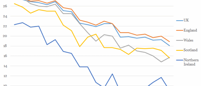
The chart shows that 2011/12 marked the point that home-owning 25-34 year olds were no longer in the majority, surpassed by those that rent privately.
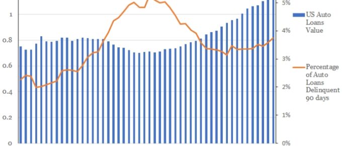
Chart of the Week: Week 16, 2017: US Car Loan Delinquency
US car manufacturers are increasingly using in-house financing.
They are also increasingly taking on riskier clients.
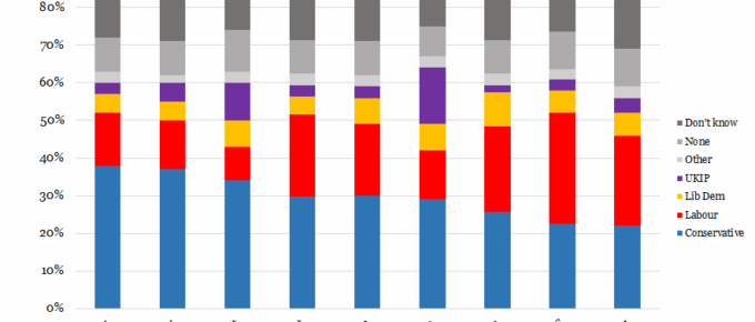
Chart of the Week: Week 15, 2017: UK Voter Sentiment on Key Issues
The chart shows that the Conservative Party enjoys the majority of support across 7 of 9 issues, with Labour support exceeding the Tories’ only on NHS and Housing.
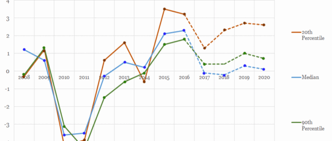
Chart of the Week: Week 14, 2017: Trends in Take-Home Pay
The chart shows that take home wages for the 2nd and 9th decile of earners have been strongly correlated in the years since the financial crisis.
Chart of the Week: Week 13, 2017: Gender Pay Gap by Country
This Tuesday 4th April was ‘Equal Pay Day’, a date symbolically chosen in the USA for two reasons: it roughly represents the date when the average woman would need to work to, from 1st of January 2016, to match the average man’s 2016 earnings.
Chart of the Week: Week 12, 2017: Workers at Risk of Automation by Sector
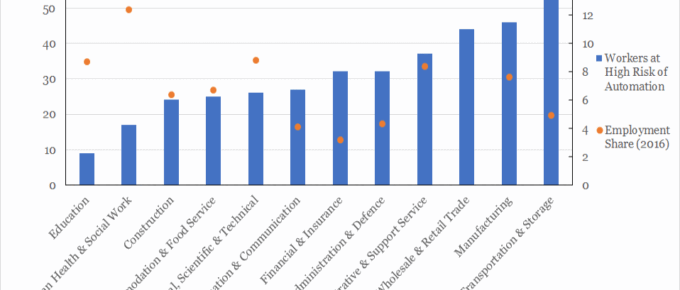
This analysis suggest that up to 30% of UK jobs are considered to be at high risk of automation by the early 2030s.

