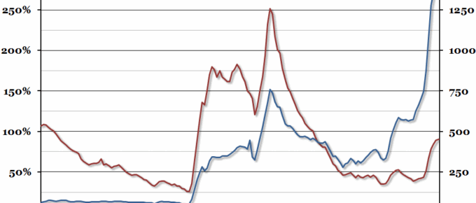
The latest public sector finances were released this morning, so we decided to update our chart from this time last year showing historical UK government debt going back to 1855 (this time in 2013 prices).
Chart of the Week: Week 16, 2014: Employment by Age Group
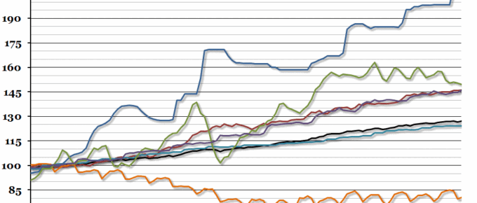
Data released today show that UK employment continued to increase, with the unemployment rate down to 6.9%.
Chart of the Week: Week 15, 2014: UK Trade
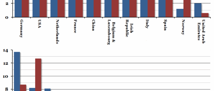
This morning, official trade statistics were released for 2013, which included details on the top import and export markets for the UK, and what commodities are traded.
Chart of the Week: Week 14, 2014: Cost of Essentials
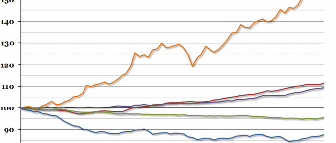
After last week’s chart on wages compared to inflation, we received plenty of correspondence asking whether CPI is the best measure for the cost of living.
March 2014
With spring in the air, we should be seeing economies improve, albeit at different rates. It is certainly likely that those in work and businesses will put the foot on the accelerator…..
Chart of the Week: Week 13, 2014: Wages vs. Prices
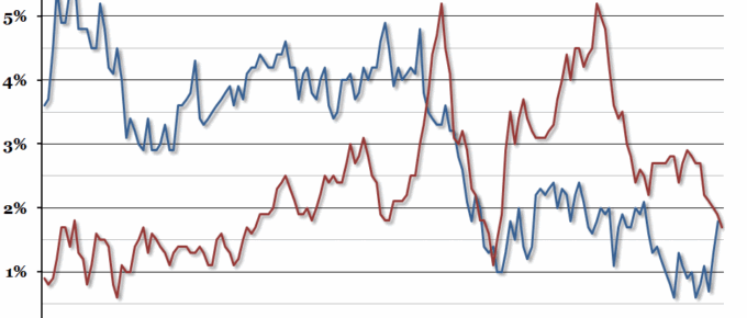
Inflation figures for February were released this week, showing a further fall in the CPI measure to 1.7%.

