Summary
Last week, we compared the latest UK recession and recovery to historical recessions. This week, we’re comparing the UK recovery to that of the US, where despite first quarter growth problems, the recovery from the recession looks strong.
What does the chart show?
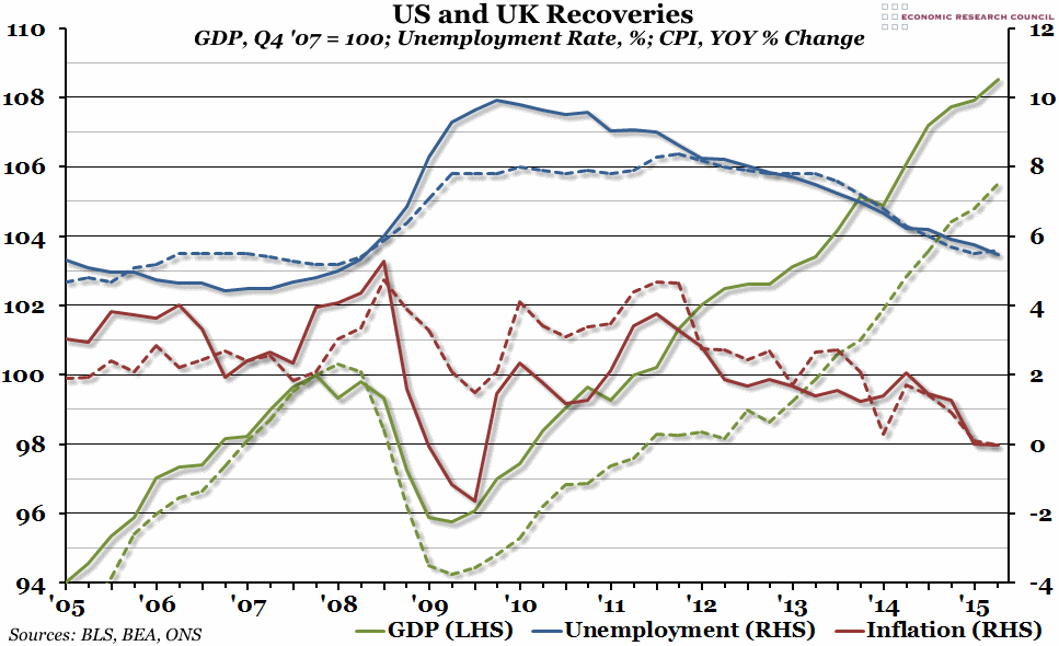
Three indicators are included in this graph, all for both the US (the solid lines) and the UK (the dashed lines). The green line, measured against the left hand axis, is quarterly Gross Domestic Product (GDP), indexed so that the pre-recession peak in the US (in the final quarter of 2007) is equal to 100. The blue line, measured against the right hand axis, is the monthly unemployment rate (the percentage of people currently available to work who do not have a job) averaged over each quarter. Finally, the red line is the percentage growth of the monthly CPI measure of inflation compared to the same month in the previous year, also averaged over each quarter and measured against the right hand axis.
Why is the chart interesting?
In terms of GDP growth, the recession in the US was not as bad as it was in the UK. The initial trough was shallower, and the bounce-back was stronger and more sustained, with the combined effect that GDP levels in the second quarter of 2015 were more than 8% higher than the pre-recession peak in the US, compared to under 6% higher than the peak in the UK. However, the US labour force was hit much harder, with unemployment rates doubling; this was far worse than anything we saw in the UK. For the past three years or so, the unemployment rates in the UK and the US have been roughly the same, and on a similar downward trajectory. Similarly, the current low inflation period is a shared international phenomenon, with low global oil and food prices, but in the immediate aftermath of the crisis in 2008, the US suffered a much more violent swing from high inflation of over 5% down to deflation of almost -2% in under a year.

