The Office for National Statistics’ annual household spending report came out last week, so this week’s chart is on how household spending has changed over the past decade (just in time for Christmas).
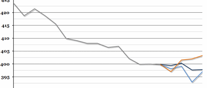
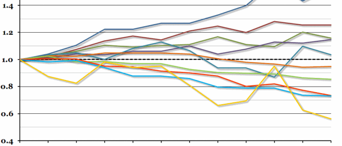
Chart of the Week: Week 50, 2013: UK Average Earnings Forecast
The Economic Research Council’s third annual Clash of the Titans was held last night, and we received three sets of forecasts from three leading economic thinkers (you can see their forecasts in full here).
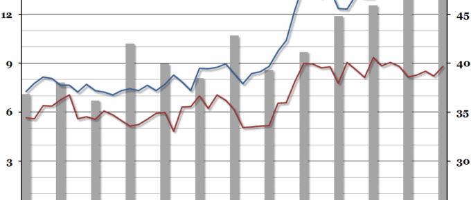
Chart of the Week: Week 47, 2013: The Graduate Labour Market
Summary Following on from our chart last week on underemployment, this week we looked at the interaction between recent graduates and young non-graduates in the labour market, courtesy of a recent ONS report. What does the chart show? The red and blue lines show the unemployment rate (the percentage of people within a group that […]
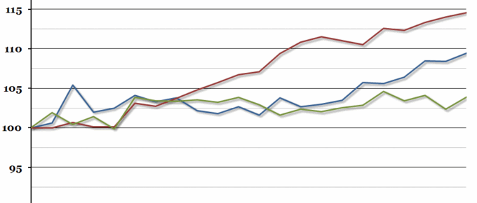
Chart of the Week: Week 44, 2013: Household Disposable Income
The Office for National Statistics November Economic Review pointed out this week that although we have begun to experience decent economic growth again, there has been very little growth in real household disposable income since the beginning of 2009.

October 2013
The light at the end of this particular tunnel is the hope that our political classes will get the message that less legislation, less pandering to vested interests and more concentration on balanced budgets might be politically popular. Always looking for this elusive light, one can only hope…..
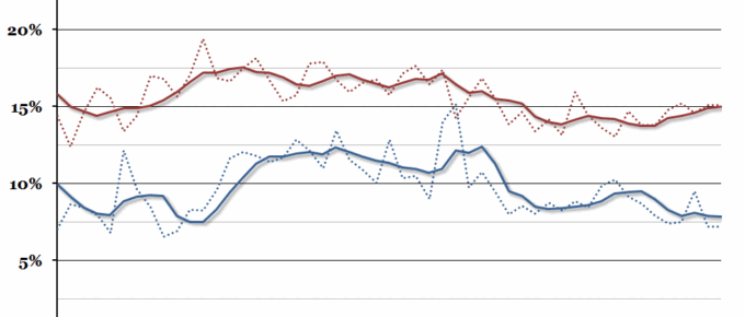
Chart of the Week: Week 41, 2013: Profitability of UK Companies
There has been quite a contrast in profitability in the services and manufacturing sectors recently, with the services sector at a four year high, while the manufacturing sector is at a ten year low.