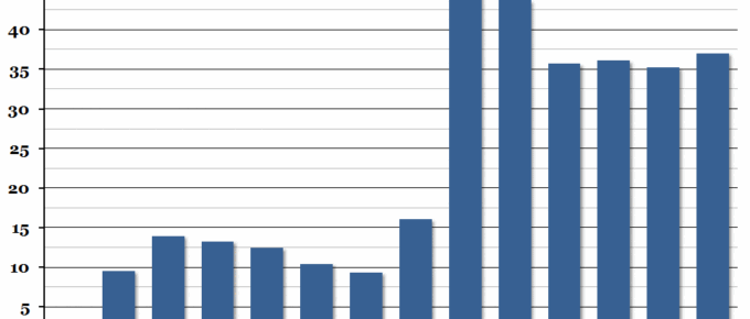
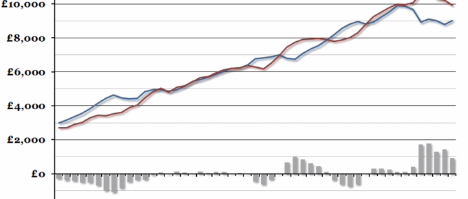
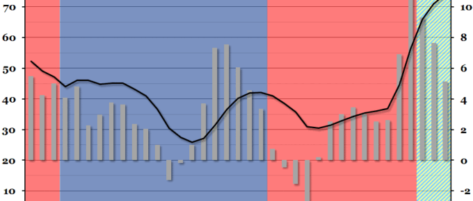
Government financial statistics were released at the end of last week, showing that public sector net borrowing was higher in the first third of the financial year than in any other since 2010.
Chart of the Week: Week 26, 2014: UK Government Revenue
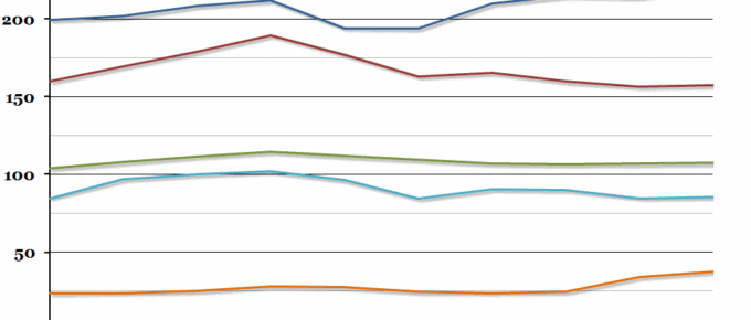
The UK public sector finances for the financial year 2013-14 were released at the end of last week, so we have updated our previous graph on sources of government revenue over the past ten years.
Chart of the Week: Week 19, 2014: UK Healthcare Spending
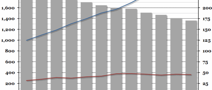
Per capita healthcare spending in the UK has slowed down massively since the 2008 recession, with spending on private healthcare decreasing even in nominal terms since the peak in 2007.
Chart of the Week: Week 17, 2014: Historical UK Government Debt
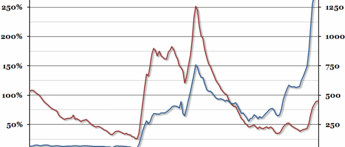
The latest public sector finances were released this morning, so we decided to update our chart from this time last year showing historical UK government debt going back to 1855 (this time in 2013 prices).
Chart of the Week: Week 12, 2014: UK Government Finances
This afternoon, the Chancellor will present the UK Budget for the coming year.
Chart of the Week: Week 48, 2013: Public Sector Finances
Public sector finance figures were released at the end of last week, showing that net borrowing had decreased in the financial year 2012/13.

