Summary
In contrast to the UK recovery (covered by last week’s chart), the US economy has been looking very positive for a while now. This week, we have taken a look at some of the key indicators that show the extent of the recovery.
What does the chart show?
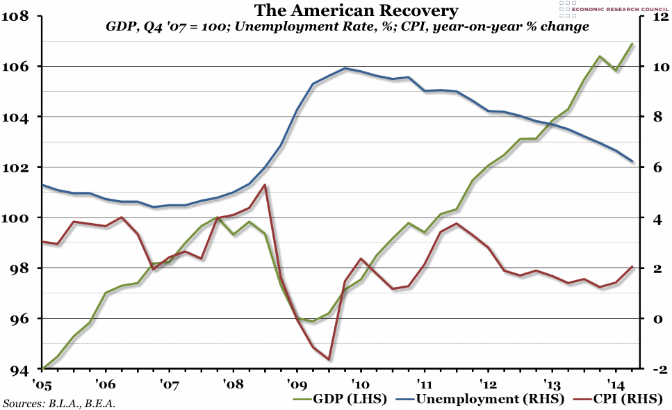
Three indicators are included in this graph. The green line, measured against the left hand axis, is quarterly Gross Domestic Product (GDP), indexed so that the pre-recession peak (in the final quarter of 2007) is equal to 100. The blue line, measured against the right hand axis, is the monthly unemployment rate (the percentage of people currently available to work who do not have a job) averaged over each quarter. Finally, the red line is the percentage growth of the monthly CPI measure of inflation compared to the same month in the previous year, also averaged over each quarter and measured against the right hand axis.
Why is the chart interesting?
The period when the recession started in 2008 to the economic trough in the third quarter of 2009 is clearly shown in this graph as GDP plummeted, inflation became deflation, and unemployment rates doubled. Since then, however, GDP has grown much faster than it has in the UK, with total output now more than 11% higher than it was at the low-point of 2009 (despite a blip in the first quarter of this year). Inflation appears to be under control, and has been hovering between 1% and 3% since 2012. Although unemployment has taken a bit longer to recover, it is now not far from the pre-crisis rate and lower than it is in the UK at the moment. From our perspective on the other side of the Atlantic, everything is looking positive in the US economy right now.

