Summary
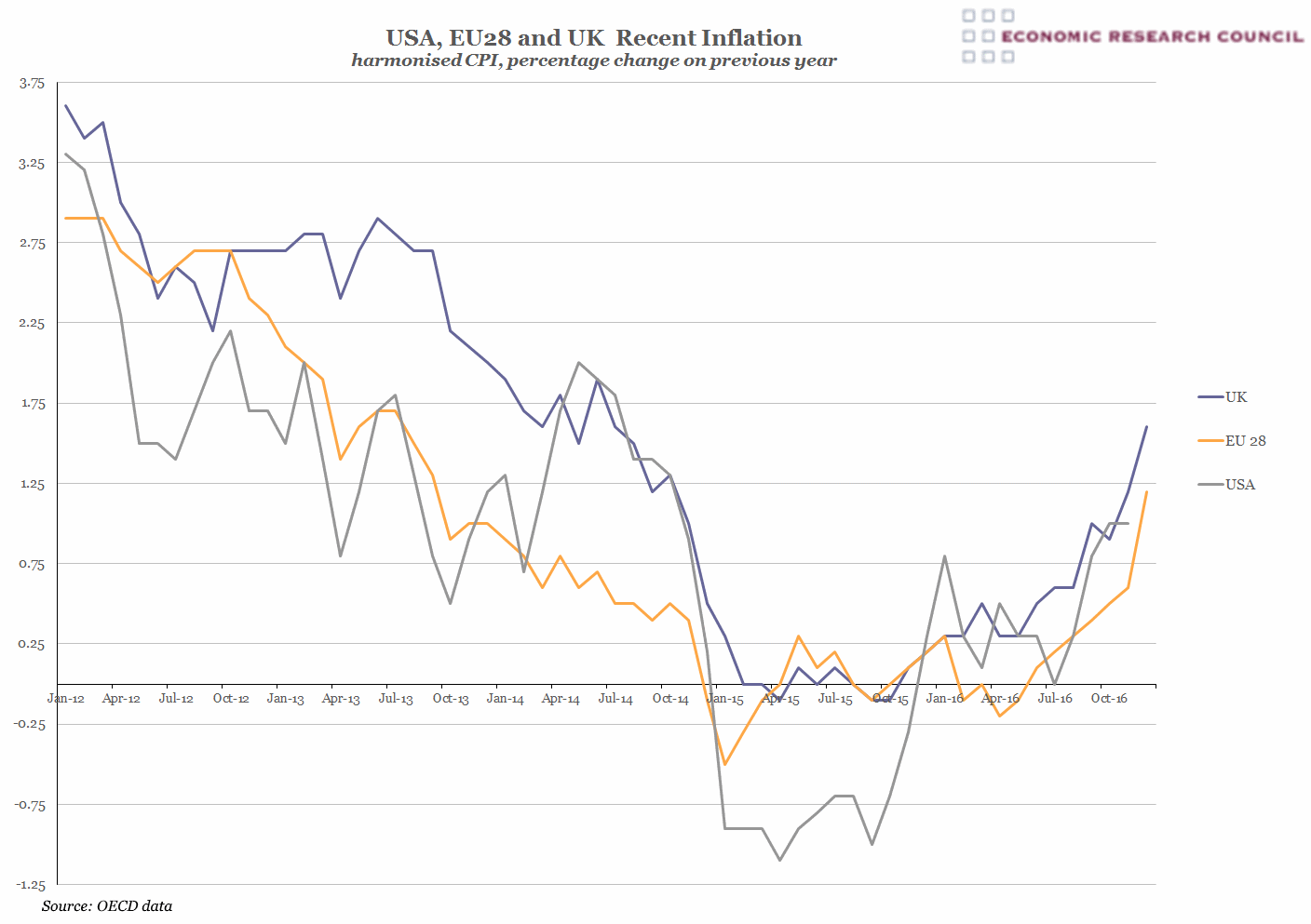
The chart shows that in 2016 the HICP rate of inflation for all three parties rose above 1% for the first time in over 2 years. The chart demonstrates how during the period from the start of 2012 to mid-2015, all parties experienced a generally similar trend of falling inflation rates. This is likely due to all parties maintaining similar interest rates throughout this period.
What does the chart show?
The blue line shows UK inflation and the grey line represents that of the USA. The yellow line shows inflation rate of the EU28 states, which includes the UK as the data did not provide weights to permit its removal. The data shows the percentage change year on year. A common basket of goods is used to calculate the Harmonised Indices of Consumer Prices (HICP) across the EU and in the US. This is equivalent to CPI for the Uk. The data begins with January 2012 and runs until December 2016, with the exception of the US which is only available until November 2016.
Why is the chart interesting?
The chart shows that UK inflation rates exceed the EU most of the time. The UK only exhibits a lower rate of inflation than the EU28 in 3 quarters of the five year period shown. The US experienced a period of deflation in 2015, which was principally caused by the fall in global oil prices, which are denominated in dollars. With more delay than for the US, global oil price rises affect all EU states’ rate of inflation and explain the 2016 climb in inflation rates that can be seen in the chart. According to the ONS, in December 2016; France, Germany and the UK all reported a year-on-year growth rate of over 5% for the fuel and lubricant component of the HICP alone. Currency exchange rates also have a clear impact, with the effect of the post-referendum 17% fall in sterling against the dollar evident in the sharp rise in UK inflation.

