Summary
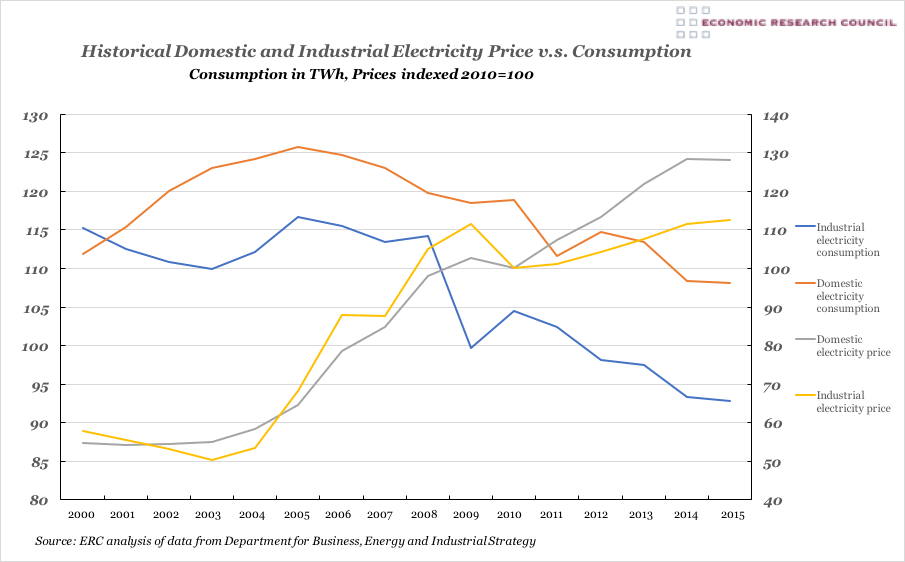
In this chart we can see that from 2000, consumption by both industry and the public has declined. The price of electricity supplied to both domestic and industrial sectors has risen significantly. The effect of the 2008 global recession is visible in the drop in consumption, which is far more pronounced for industry than domestic. This reduction in consumption has an effect on the electricity price, which also falls. The fall in prices following the recession is more significant for industry and takes longer to resume the rising trend than the domestic prices.
What does the chart show?
The chart displays the industrial (blue) and domestic (orange) electricity consumption in trillion Watt hours, measured against the left-hand axis. The data is annual from 2000 until 2015. Against the right-hand axis, the trend in the cost of electricity is displayed for domestic (grey) and industrial (yellow) use. The price data is indexed from 2010.
Why is the chart interesting?
The chart shows that rising electricity prices pose a significant headwind for industrial expansion in the UK. These prices have risen as the sources of electricity generation have diversified increasingly into the use of renewable energy and shows that more work is urgently needed to make renewable energy more cost effective to generate and affordable. The chart shows that the government’s commitment to rebalancing the UK economy in favour of industry faces a significant hurdle in the prohibitive rise in the price of electricity. Looking at domestic consumers, the chart helps demonstrate that increases in fuel poverty in recent years is resulting from sharply rising electricity prices as well as the reduction in income in households following the 2008 recession.

