Summary
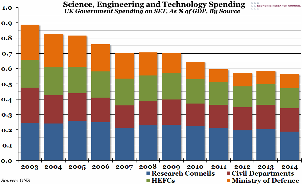
The Office for National Statistics released their annual report on government spending on science this week, and although in nominal terms spending has increased by more than £2 billion since 2003, it has fallen significantly as a proportion of GDP.
What does the chart show?
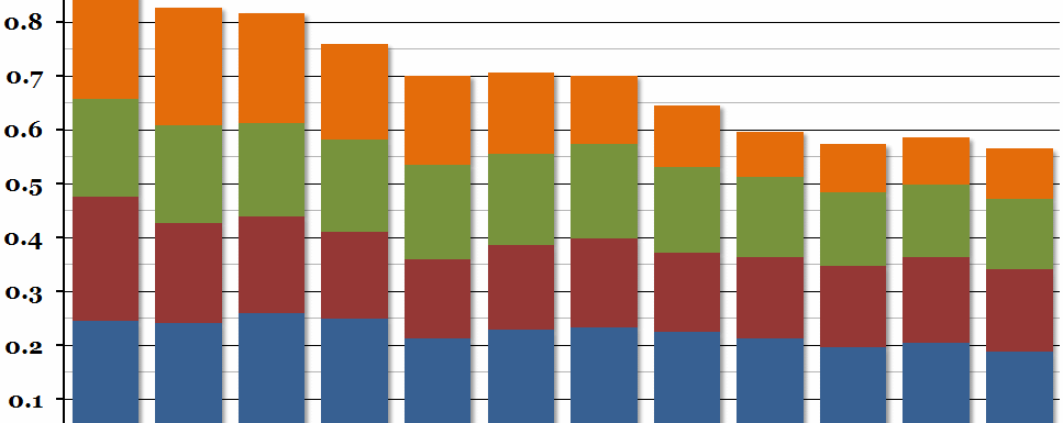
The chart shows total annual UK government expenditure on science, engineering, and technology (SET), as a percentage of Gross Domestic Product (GDP). Within each bar, the different colours represent the different government bodies funding SET: the Research Councils in blue, civil government departments in red, Higher Education Funding Councils (HEFCs) in green, and the Ministry of Defence in orange.
Why is the chart interesting?
Unlike other measures of R&D spending, these figures include not only in-house research, but also net spending on external research, so they cover total government spending on science, engineering, and technology. This spending is crucial to future economic growth, as well as to improving general standards of living, so it is alarming to see that the government is spending almost a third less on SET now than it did a decade ago as a proportion of our national output. It is important to point out that this is not due to cuts in funding – in nominal terms, spending on SET has risen in 8 of the last 11 years – but more that science is falling in relative importance as funding increases are failing to keep up with increases in national income. Spending by all four major sources shown in the chart have fallen, but the Ministry of Defence’s decrease in importance is the most striking, falling from 0.23% of GDP in 2003 to 0.09% in 2014.
Note that this does not include SET spending by the EU in the UK, which has historically provided a net contribution to our science funding. If that disappears as a result of Brexit, the government will have to do even more to fill that gap.

