Summary
Preliminary growth figures for the final quarter of last year were released yesterday, and although quarterly growth slowed down to 0.5%, 2014 was still the best year of growth since 2007 with an annual rate of 2.6%. We’ve updated our per capita GDP graph from last year with the new figures.
What does the chart show?
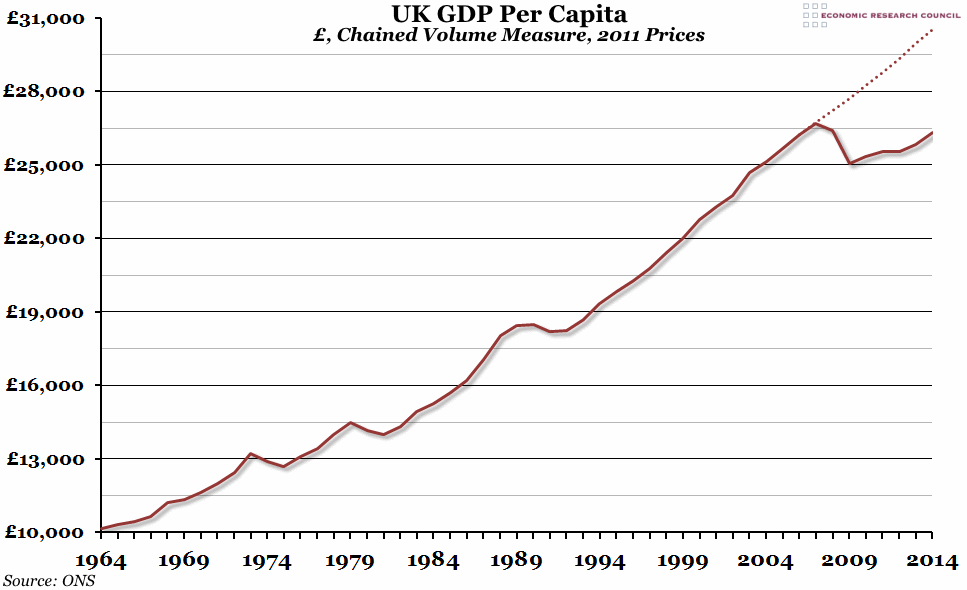
This chart shows gross domestic product (GDP), adjusted for inflation using the chained volume measure (with 2011 as the base year) and divided by the average estimated population in each year (according to the ONS) to get a per capita figure. The dotted line shows the estimated trend line, based on the 20 years of growth between 1988 and 2007, that we might have expected if it were not for the recession.
Why is the chart interesting?
The period between 1964 and 2007 saw steady per capita GDP growth in the UK, with only a few years where GDP per capita decreased. Between 1988 and 2007, average annual growth was 2.7%. The dotted trend line shows what could have happened if that had continued: GDP per capita would have grown to almost £31,000. However, the recession caused by the financial crisis in 2007/8 was one of the worst we’ve ever experienced (in terms of lost output, at least), and we are only now just starting to recover. As you can see from the graph, a return to more normal levels of growth in 2014 (despite a slowdown towards the end of the year) meant that we ended the year tantalisingly close to the 2008 per capita figure: £26,318 in 2014 compared to £26,408 in 2008 (the peak was £26,712 in 2007).
This time last year we reported that 2003-2013 was the worst ten years of GDP per capita growth on record (breaking the previous record held by 2002-2012), with a growth rate of just 4.6%. The latest decade (from 2004-2014) was marginally better, recording a growth rate of 4.8%, and is instead only the second worst on record.
You can listen to Greg Opie talking about this Chart of the Week on Share Radio by clicking here.

