Summary
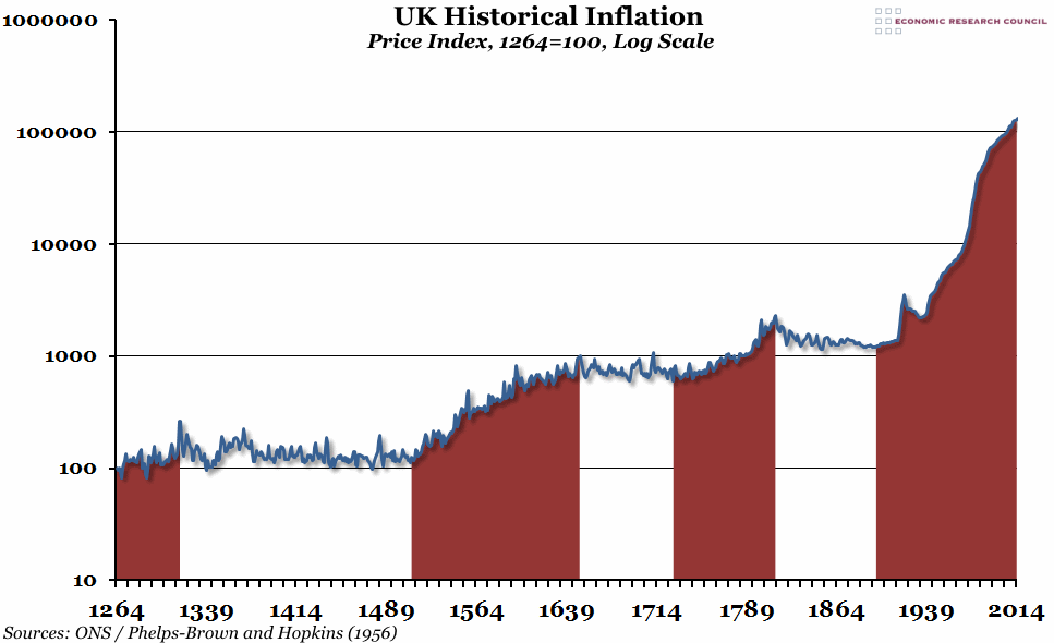
Next week, Pete Comley is coming to speak to the ERC on “Inflationary Wave Theory”. In preparation, we’ve taken a look at the last 750 years of UK inflation in a graph that originally appeared in his latest book, “Inflation Matters”.
What does the chart show?
The chart shows an historical price index, calculated primarily in the work of Sir Henry Phelps-Brown and Sheila Hopkins and based on records of household accounts in Southern England, rebased so that the index is equal to 100 in 1264. The latest data is taken from the ONS. A log scale is used due to the large increases in prices over the period.
Why is the chart interesting?
Pete’s “Inflationary Wave Theory” puts forward the idea that inflation follows a periodic pattern, with an era of price inflation followed by an era of consolidation and price stability. In the chart above, we’ve highlighted the inflationary periods in red. Although you can see that there are clearly annual variations in prices within each era, the general trend appears to follow the theory. Each period of inflation has resulted in exponentially larger price increases – during the four highlighted periods above, the average annual price increase was 0.5%, 1%, 2% and 4% respectively.
Having lived through a period of almost constant inflation, it is hard to imagine a world with steady prices, but they have been the norm for nearly half of the last 750 years. If the theory is correct, we should be heading towards another period of stability soon.
If you are interested in hearing more, you can book your place at the ERC talk on Monday 18th May by clicking here.

